Page Creating
Page creating
(Continuing from Pages)
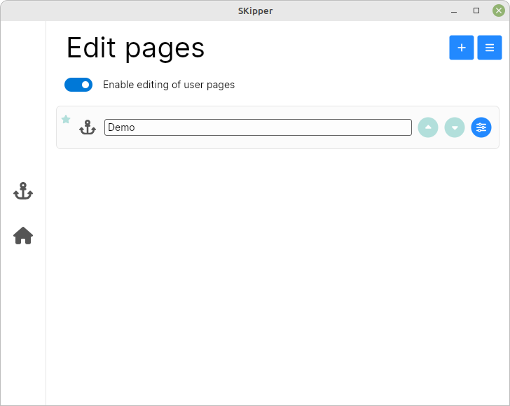
Although you've technically created a Page, there's nothing on it yet. So now, let's really create it! Click on the blue circle icon on the far right side, and you'll see a menu of all the things you can do with this Page:
- Open page: to see what it looks like, and edit its content if you want
- Edit page: to edit the basic properties of a Page (its name, icon, etc.)
- Show page on startup (One of your Pages can always display as soon as you start SKipper)
- Copy page (To use this Page as a template for another Page)
- Delete page (This cannot be undone, so be careful!)
- Cancel (Closes the menu)
Click on "Open Page" to go to your newly-created Page. Because there's nothing on it yet, you'll be prompted to add something:
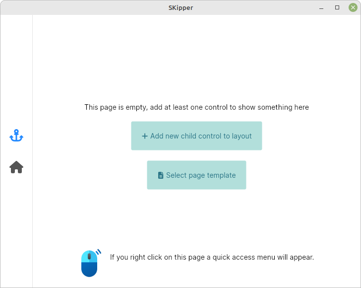
We need to add something to this empty Page, so click on "+ Add new child control to layout", and a window will pop-up showing all of the Controls you can add grouped by type (Action Buttons, Content Controls, Gauges (a very specific type of Content Control), and Layout Controls.) Scroll down that list to see all of your choices, and at the very bottom, click on "Grid". The Grid properties window will appear, and if you scroll down just a little, you'll see that it has defaulted to a Grid with three rows and three columns.
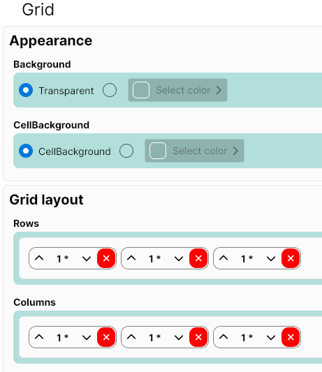
The default Grid has all of the rows the same size, and all of the columns the same size - that's why there's a "1" in each of the little boxes. But we want a Grid with a single column, and with different sized rows. So delete the two right columns (click on their little red-and-white "X"), and change the row sizes to be 1 - 5 - 2, as shown below:
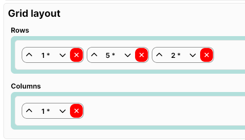
When you click the "Close" button, you'll see your new Layout: a Grid with one column and three rows: a small top row, a large middle row, and a medium-sized bottom row. (See image below.) Each of the three panels in the Grid has a blue "+" icon, and in the upper left corner, there is a very light green icon called "GridLayoutControl". That icon will bring up the window you just closed, so if you didn't define your rows and columns correctly, you could fix that now.
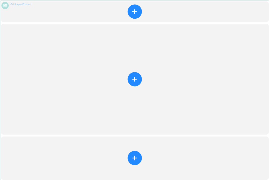
This Layout would not be very useful, so we're going to keep working on it. First, we'll divide the top row into a Grid with four smaller panels. Click on the blue "+" icon in that top row, then scroll down to the bottom of the Controls window and click on Grid, and then define that Grid with just one row, and four columns, each of the same width, as per below:
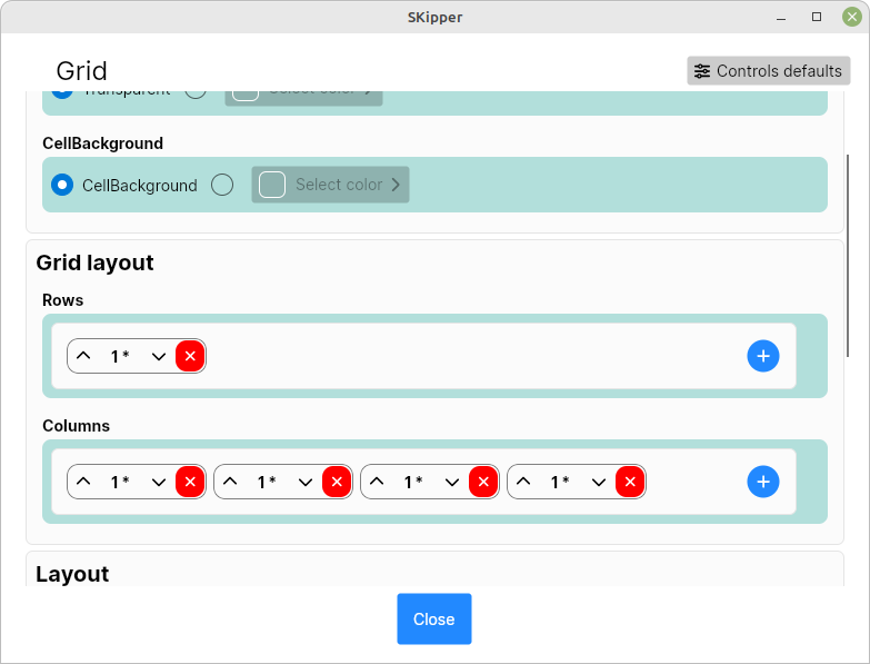
Click "Close", and now you see that you've split the top row of the main Grid into a smaller Grid with a single row and 4 columns. Let's keep working on our Layout: click on the blue "+" icon in the very middle of the Page. Scroll down and select Grid, and change the Grid so it has one row and three columns, and the proportional size of the columns is "3 - 1 - 3". The result should look like this:
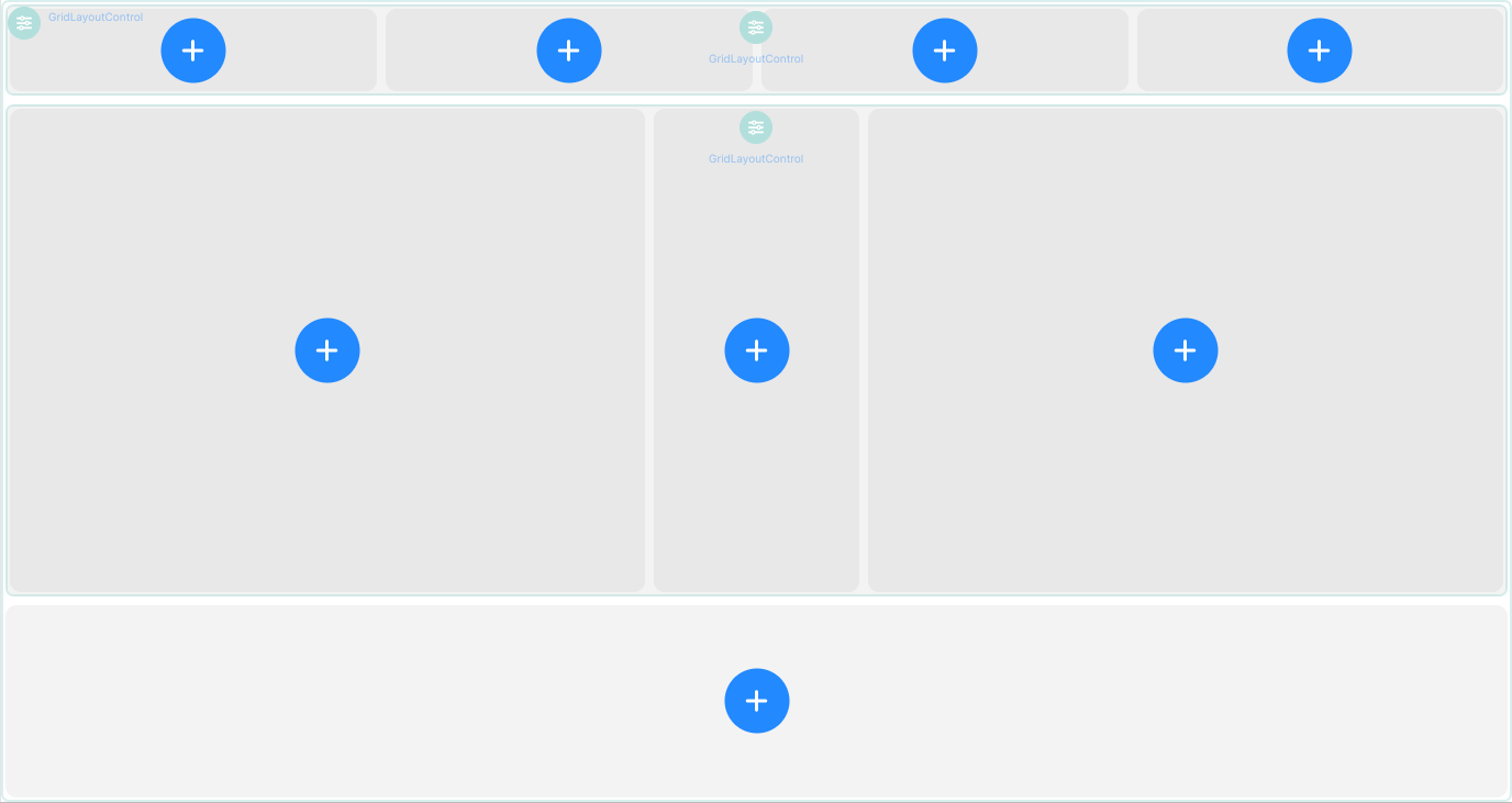
Notice the light green icon and "GridLayoutControl" in the upper left of the big square on the left side of the Layout. That icon allows you to edit the Grid that you just added - the "3 - 1 - 3" grid. Icons for editing Layout Controls (Grid, Stack, and Group) are always light green, and appear in the upper left corner of the Control, unless there is already another icon there. For example, look at the top row in the image above. There's a "GridLayoutControl" icon in the upper left, and another "GridLayoutControl" in the middle. The one in the upper left is for the first Grid Control that you added to this Page. The one in the middle is for the 1 x 4 Grid that you added to the top row of the main Grid. This is done simply to keep Layout Control icons from being on top of each other.
We're going to make one more enhancement to our Page Layout. Click the blue "+" in the very middle of the Page, then scroll down and add a Stack. We don't need to change any of its properties, so click the "Close" button.
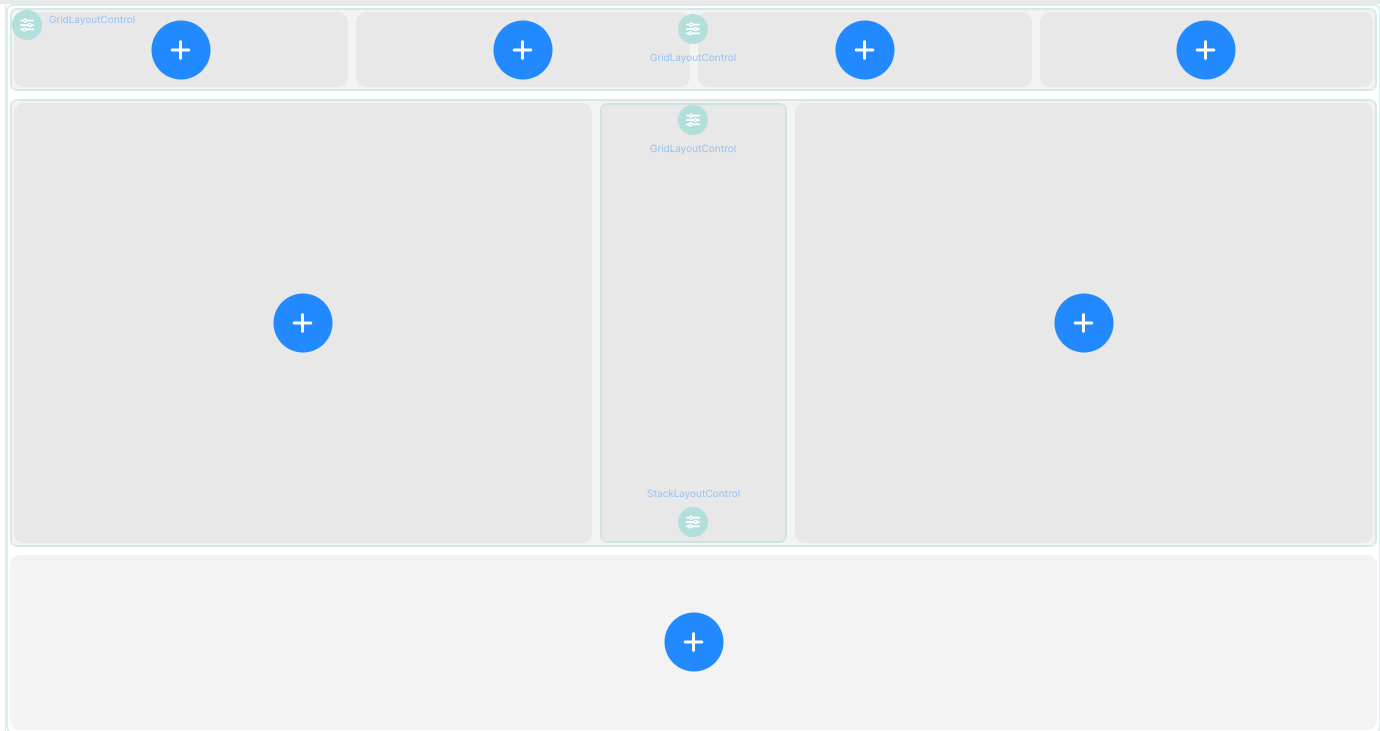
Congratulations! You've done the Layout for your first Page! Of course, there's nothing on it yet, so it's not very useful, but we're going to fix that next. By the way - if you're doing this on a phone in portrait mode, it looks something like this:
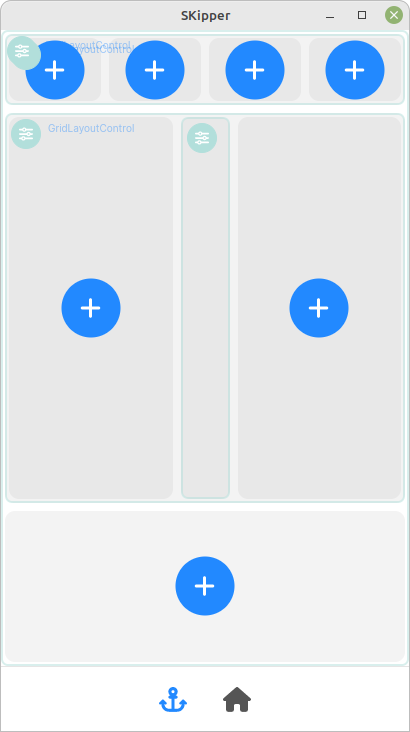
That's not at all what we're going for, and is not going to be very useful. But if you turn your phone sideways, it should look a lot more like the previous image, and should be usable and useful.
Adding Content Controls
Compass Control
So far, we've added only Layout Controls, and by now, you should have a pretty good idea of how to use the Grid to organize a Page the way you want. Now we'll add the Content Controls, starting with the easy ones - the Gauges. Click on the blue "+" in the big square in the left center of the Page, then scroll down to the "Gauges" section, and click on Compass. The Compass properties window appears. You can give it a Title if you like, but it's going to be pretty obvious that it's a compass, so you don't really need to.
The next field, "Course", has a little icon at the far right that looks like two links of a chain. That's the "binding" icon in SKipper, and you'll see it by any field that can be connected to a Signal K path. Click on it to bring up the Binding properties window, below.
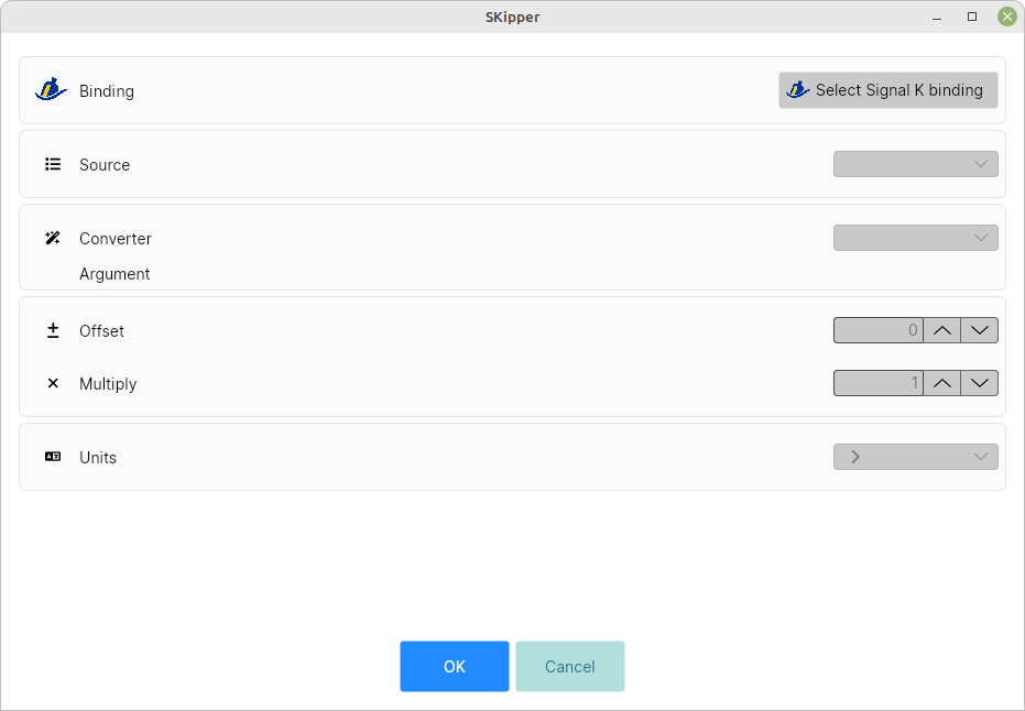
Click on the "Select Signal K binding" button. In the very upper left of the window that appears, type "head". Notice that as you type, the list of paths gets smaller and smaller, because SKipper is showing only paths that contain whatever text you have typed so far. (This is not obvious in the Signal K Demo Data because there aren't very many paths, but it will be very obvious if you're searching through a lot of paths.) The only path that contains the text "head" is navigation.headingTrue. Click on it to highlight it, then click on "OK". You should return to the Binding properties window with navigation.headingTrue in the upper right corner.
"Source" allows you to select a source for this Signal K path, if for some reason you have more than one. That's unusual, so we'll ignore that field throughout this part of the documentation.
There is no "Converter" for this Control, nor would you use an "Offset" or a "Multiply" for it.
"Close" that window, and you'll see a notification about the path and units (image below). This just means that SKipper is going to automatically assign the units for this binding as "deg" (degrees), but you can change that later if you like.

Click "OK" to close that notification, and you'll see that the "Course" field now says navigation.headingTrue; you have completed the binding of that Signal K path to this field in SKipper. This is something you'll do for almost every Content Control you have in SKipper.
There are no other Compass properties we need to change, so "Close" that window, and you have successfully added the first useful content to your SKipper UI!
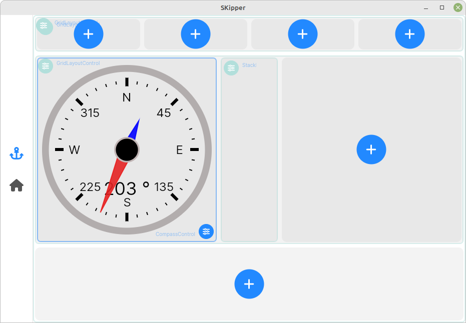
Notice the little blue icon in the lower right corner of where the Compass is, with the word "CompassControl". Click on it so we can see what it does:
- Edit control properties: edits the properties of the Compass.
- Copy control: you can copy-paste a control from one location to another, which will be useful later.
- Delete control
- Move control: allows you to move a Control to another panel in the same Grid, or to another location in the same Stack.
Wind Gauge Control
Now we'll add a Wind Gauge to the big square on the right side of our Layout. Here are the abbreviated steps:
- Click the blue "+", then select WindGauge.
- Make the Title field be "Apparent Wind".
- For Wind Angle, bind to the Signal K path environment.wind.angleApparent, change Units to "deg".
- For Wind Speed, bind to environment.wind.speedApparent, change Units to "kn" (knots).
- "Close" the WindGauge properties window, and now you have a Compass and a Wind Gauge!
Next, we'll add some data to our top row. Two of these will be of type "Label" and two will be "TitleValue". From now on, the instructions will be significantly abbreviated, since you're getting so good at this!
Date and Time (Label Control)
- Click the blue "+" in the far-left panel on the top row, and select "Label".
- A Label Control can display static text (whatever you type in the Text field), or it can display something from Signal K. This is going to display the current date and time, so bind this field to navigation.datetime, and use the Converter "Datetime to string", and the Argument "DDD MM SS N/S/W/E", and check the "Two lines" checkbox. (See Controls - Data Converters for details about using this Converter.)
- After you select the binding, scroll down in the Label properties window and change the Font Size to 20 and the Weight to "bold".
- Scroll farther down to the Alignment section and change the Vertical to "center".
- "Close", and now you have the current date and time in that spot. (It's probably not correct, since it's coming from the Signal K demo data. Don't worry about that.)
Latitude and Longitude (Label Control)
- Click the blue "+" in the panel to the right of Date and Time, and select "Label".
- Bind the Text field to navigation.position, and use the Converter "Position to WGS-84 string", and the Argument "datetime". (See Controls - Data Converters for details about using this Converter.)
- After you select the binding, scroll down in the Label properties window and change the Font Size to 28 and the Weight to "bold".
- Change the Horizontal AND Vertical alignment to "center".
- "Close", and now you have the boat's current position in that spot.
The next two Controls are going to be of type TitleValue. As a reminder (from the Controls Overview chapter), this is what they look like:

Trip Log (TitleValue Control, Default version)
- Click the blue "+" in the panel to the right of Latitude and Longitude, and select "TitleValue".
- Make the Title field "Trip log".
- Bind the Value field to navigation.trip.log and change Units to "nm" (nautical miles).
- After you select the binding, change the Units field to "nm".
- Change the Font Sizes: Title Size to 19, Value Size to 30, and Units Size to 19.
- "Close".
Course Over Ground (COG) (TitleValue Control, OneLine version)
- Click the blue "+" in the far-right panel on the top row, and select "TitleValue".
- Make the Title field "COG".
- Bind the Value field to navigation.courseOverGroundTrue, change the String Format to "000", and change Units to "deg" (degrees).
- After you select the binding, make the Units field blank.
- Change the Appearance from "Default" to "OneLine". This is a slightly different presentation for a TitleValue Control.
- Change the Font Sizes: Title Size to 30 and Value Size to 50. (Units Size doesn't matter, as you left the Units field blank.)
- "Close".
Now your entire top row should be complete, with the Date/Time, Latitude and Longitude, Trip Log, and COG. But it doesn't look so nice, with all of those Control editing icons:
![]()
Let's get rid of them. If you're using a computer with a mouse (or mouse substitute) that has a right-click function, do that now (right-click), then click on the first menu item, "Exit page control editor". Voila! All those editing icons disappear, and you should see this! (On a touchscreen device, press-and-hold on the screen for a few seconds and the same right-click menu will appear.)
![]()
It's starting to look pretty good, and we still have several more Controls to add. But let's take a short break from adding Controls, to show you a few other things you can do that will come in handy. You just saw one - the ability to switch in and out of edit mode with a right-click menu. You can also switch between Light and Dark Themse with that right-click - try it now. (But if you have automatic theme switching enabled in Signal K, SKipper will automatically switch when Signal K does, unless you don't want it to.)
Moving A Control
You can also move Controls to a certain extent. Look at the top row of the Page we've been working on - maybe you decide that you'd rather have COG at the left end of that row, and Date/Time at the right end. Get back into editing mode if necessary (with the right-click menu), and click on the editing icon for the COG Control. Select "Move control" from the menu and you'll see this:

Click on the round blue icon that's on the Date/Time Control, and select Switch Control Positions. That's exactly what happens - COG is on the left, and Date/Time is on the right. You can do this multiple times to completely reoganize an entire Grid!
Speed Over Ground (SOG) (HorizontalBar Control)
OK, we still have some more Controls to add to our Demo Page. We're going to add a few to the very center of our Page, between the two big round gauges. You may remember that we placed a Stack Layout Control there when we were doing our Layout - and in fact, you can see the little light green StackLayoutControl icon in that center section. Click on it, and a menu will pop up.
- Select "Add new child control to layout".
- Select a HorizontalBar.
- In the Title, put "SOG".
- Bind the Value to navigation.speedOverGround and change the Units to "kn".
- After you select the binding, make the Units field blank.
- Leave "Minimum" at 0, but change "Maximum" to 10.
- Change "Rounded to" to 0.5. This will give you a pretty accurate figure without all of the 0.1 knot fluctuations.
- Change the Font Sizes: Title Size to 20 and Value Size to 30. (Units Size doesn't matter, as you left the Units field blank.)
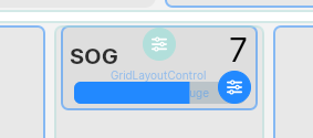
- "Close", and you should have a new Control that looks like this:
Copying A Control / Speed Through Water (STW)
Our next Control is for Speed Through the Water, which will be presented just like SOG, so we can use the copy feature.
- Click the little blue editing icon in the lower right of the SOG Control, and select "Copy control".
- Click the little green editing icon in the center panel, "StackLayoutControl", and select "Add new child control to layout".
- Since this Control is being placed in a Stack, you have the option of where in the Stack you want it. By default, it will go "At the end", but you can change that to "Before SOG". Leave it "At the end".
- Don't scroll down to select a type of Control. Instead, click on "Paste copied control" to paste the SOG Control.
- In the HorizontalBar properties window, simply change the Title to "STW" (Speed Through Water), and change the binding to navigation.speedThroughWater.
- After selecting the binding, just "Close", and you now have a STW Control that's configured just like the SOG Control.
Water Temperature (VerticalBar Control)
To finish out the center of our Page, we're going to add Water Temperature. (Yes, the temperature is very high, but it comes from the Signal K demo data. Global warming!)
- Click the little green editing icon in the center panel, "StackLayoutControl", and select "Add new child control to layout".
- Since this Control is being placed in a Stack, you have the option of where in the Stack you want it. By default, it will go "At the end", but you can change that to "Before SOG" or "Before STW". Leave it "At the end".
- Select a VerticalBar.
- In the Title, put "Water Temp".
- Bind the Value to environment.water.temperature and change the Units to "F" (Fahrenheit).
- After you select the binding, change the Unit field to "F".
- Change "Minimum" to 70 and change "Maximum" to 120.
- Change "Rounded to" to 1. This will give you a pretty accurate figure without all of the 0.1 degree fluctuations.
- Change the icon to one of the thermometers in the Science category.
- "Close", and you should have a new Control that looks like this:
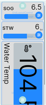
Notice that you can't see all of the Control; that the bottom part of it is not visible. Also notice that there's a very thin scroll bar on the right side of the Stack. That's a characteristic of a Stack - if you put more Controls in it than will fit vertically, it simply adds a scroll bar.
Using a Group Layout Control
The final part of our Demo Page is the bottom row. We're going to put several Content Controls in it to demonstrate the Group Layout Control. Start by clicking on the blue "+" icon, and scroll to the bottom. Notice that you see only Grid and Stack in the Layout section. That's because you can add a Group only inside an existing Stack, so click on Stack, then "Close" the Stack properties window.
Now you have an empty Stack. Click on the light green StackLayoutControl icon and choose "Add new child control to layout", and then select Group. Change Title to "House Batteries", and change the Font Size for Title to 15. "Close", and now you have an empty Group.
We're going to add five Controls to the Group to demonstrate how the Group works, and also to compare the Analog Gauge Control with the Digital Gauge Control.
Battery Voltage (AnalogGauge Control)
- Click on the GroupLayoutControl icon in the upper left corner of the bottom row of the Page, and select "Add new child control to layout".
- Select AnalogGauge.
- Leave Title blank, and bind Value to electrical.batteries.1.voltage.
- After you finish with the binding, change Units to "Voltage".
- Change Minimum to 5 and Maximum to 16.
- "Close", and now you have an analog voltage gauge in the Group.
Battery Voltage (DigitalGauge Control)
- Click on the GroupLayoutControl icon in the upper left corner of the bottom row of the Page, and select "Add new child control to layout".
- Select DigitalGauge.
- Leave Title blank, and bind Value to electrical.batteries.1.voltage.
- After you finish with the binding, change Units to "Voltage".
- Change Minimum to 5 and Maximum to 16.
- "Close", and now you have an analog voltage gauge in the Group.
The two Controls above are displaying the same information in different ways. There are a lot of things you can do to "fine tune" the DigitalGauge, which we'll demonstrate shortly. The AnalogGauge is not nearly so customizable.
Battery Amperage (AnalogGauge Control)
- Click on the GroupLayoutControl icon in the upper left corner of the bottom row of the Page, and select "Add new child control to layout".
- Select AnalogGauge.
- Leave Title blank, and bind Value to electrical.batteries.1.current.
- After you finish with the binding, change Units to "Amps".
- Change Maximum to 300.
- "Close", and now you have an analog amperage gauge in the Group.
Battery Amperage (DigitalGauge Control)
- Click on the GroupLayoutControl icon in the upper left corner of the bottom row of the Page, and select "Add new child control to layout".
- Select DigitalGauge.
- Make Title "Current", and bind Value to electrical.batteries.1.current.
- After you finish with the binding, change Units to "A".
- Change Maximum to 300.
- Change Stroke Color to any color you like.
- Change Stroke Thickness to 10.
- Change Text Color to some color that contrasts with your Stroke Color.
- Enable "Show Minimum and Maximum", and set it to "On".
- Change Title Placement to Top Center.
- "Close", and now you have an digital ammeter that demonstrates many of the customization features of the DigitalGauge Control. The bottom of your Page should look something like this:

The four gauges fill the Page horizontally because that's how the Group works - if you tell it you want four columns, it will fit four Controls in the space available. But now, let's see what happens when we add a fifth Control!
Battery Temperature (AnalogGauge Control)
- Click on the GroupLayoutControl icon in the upper left corner of the bottom row of the Page, and select "Add new child control to layout".
- Select AnalogGauge.
- Leave Title blank, and bind Value to electrical.batteries.1.temperature, and change Units from K(elvin) to F(harenheit).
- Change Minimum to 60 and Maximum to 180.
- "Close", and now you have a new analog temperature gauge in your Group, but you can barely see it! Maybe that's how you want it? You can always scroll down to see it. But if you want to see it all the time, you have two choices: either change the Group so that it has five columns instead of four, or reorganize your Page Layout so that the bottom row is a lot taller than it is now. You can try either or both of those now, but this is the essence of a Group Layout Control - it sizes the Controls that are in it so that the correct number of them will fit horizontally, and after that, additional Controls wrap to the next line.
 Five Controls in a Group with only four columns; the last Control wrapped to a new line.
 The same five Controls after the Group was changed to a five-column Group: all five are always visible.
Size and Shape of Your Screen
If you've been following the steps in this chapter on your own device, your version of the Demo Page probably looks different from the screenshots that have been included here. That's because SKipper will dynamically resize everything to fit into the rectangle that is your screen, or a window on your screen, if possible. Below are just a few variations of our Demo Page, as it might look on different devices.
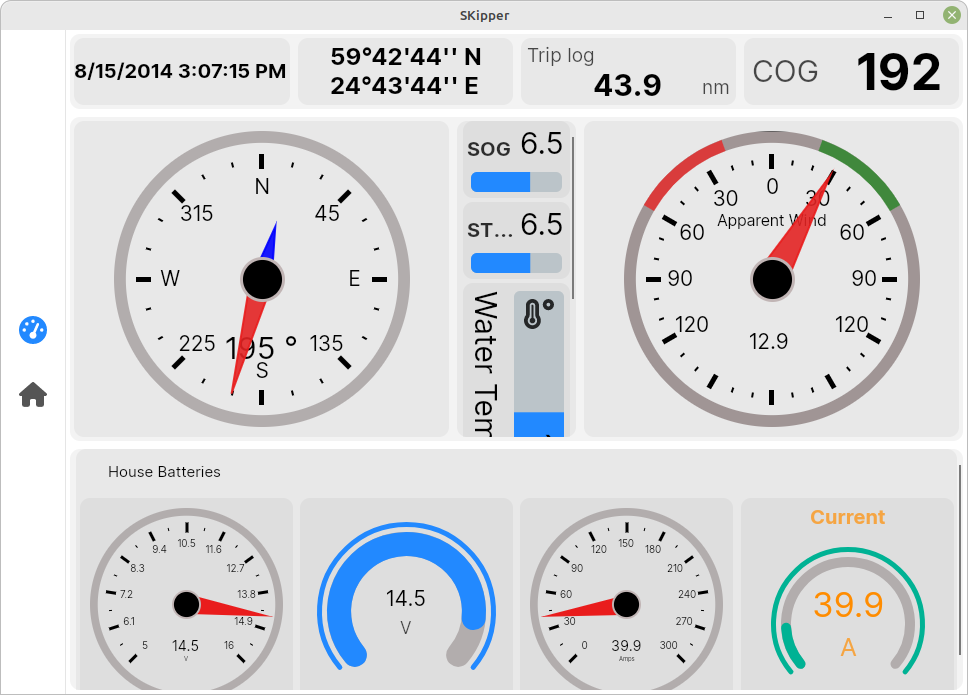 A 7" screen attached to a Raspberry Pi
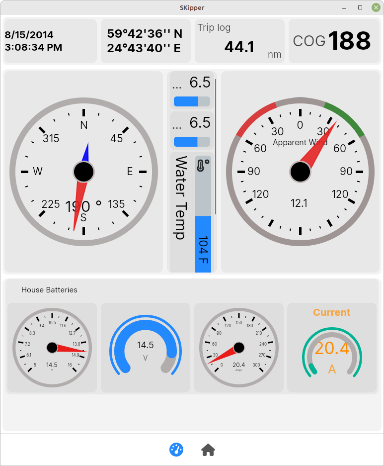 An ipad Mini in portrait orientation
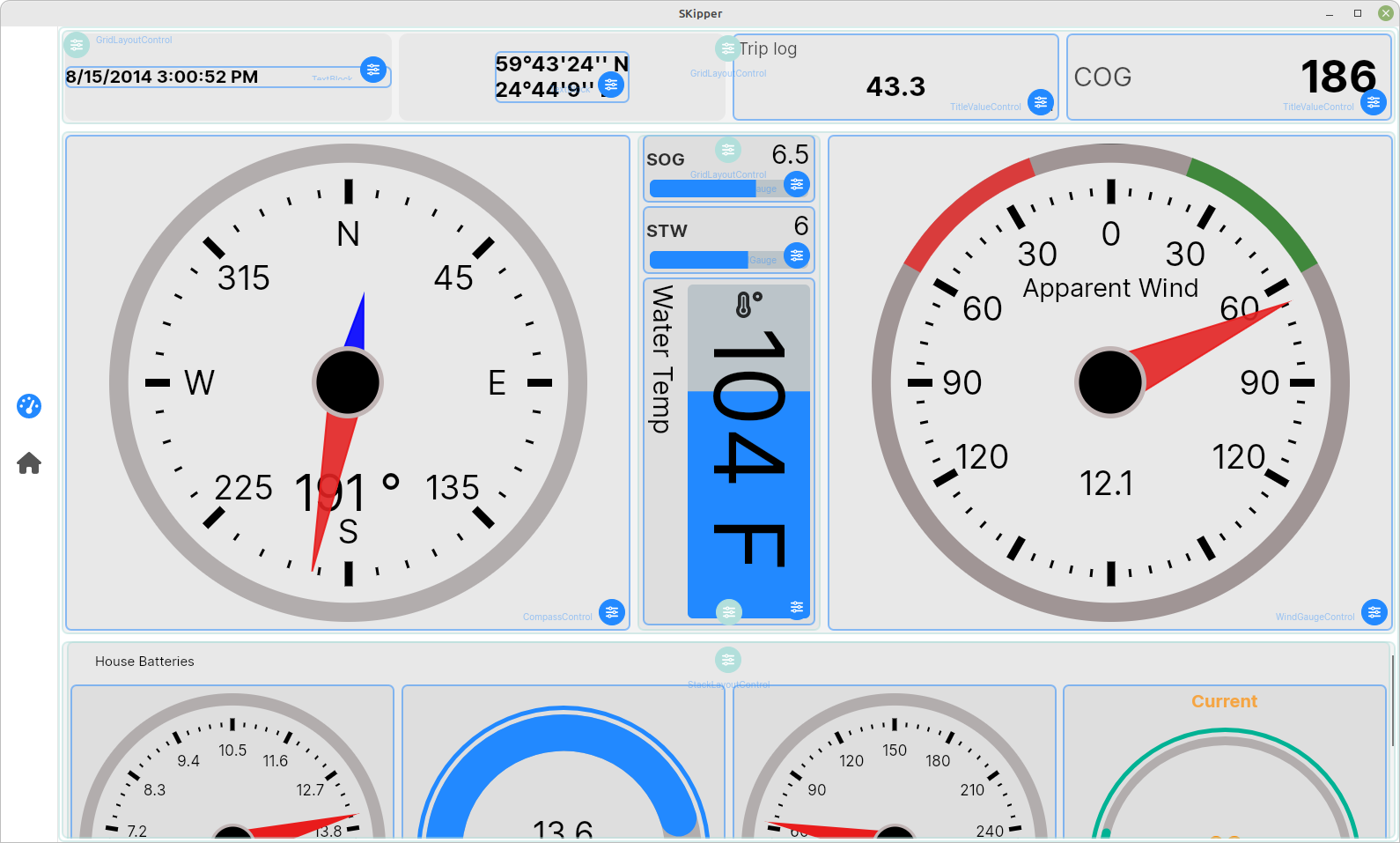 A Dell laptop in full-screen mode
The above three images are of the exact same Page defintion, but displayed on very different screens. This is being shown to you now as a reminder that it's best to create your Pages on the actual device you'll be viewing it on, OR create them on a computer (Linux, Windows, or Mac), but do it in a window on the screen that approximates the actual size and orientation of the device for which you're creating them, like below.
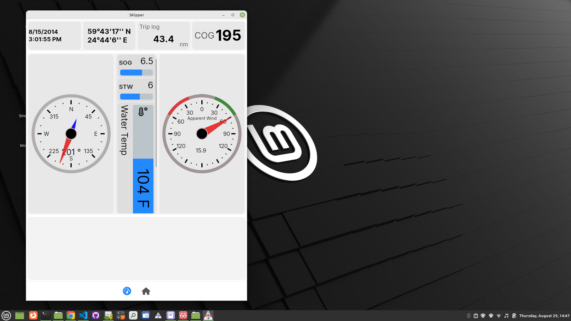 SKipper in a window on a Linux Mint laptop, simulating an ipad Mini in portrait orientation
Copying Pages
Let's say you create a Page with all of the Controls you want, but it doesn't look quite right to you, and you want to "play around with it" to see if you can make it look better. But you don't want to lose the way it looks now, in case you don't come up with a better layout. You can copy the Page, do your "playing around" with the copy, and if you like it better than the original, simply delete the original and use the copy. If you don't come up with something better, just delete the copy.
There are other situations in which you might want to make a copy of a Page - the above example is just one.
To make a copy of a Page, get to the Edit Pages screen. The easiest way is to right-click (or long-press) on any Page and select Edit Pages. Find the Page you want to copy and click the little blue circle at the far right of the Page, and a menu appears. Select "Copy Page" from that menu, and a new Page appears at the bottom of your Edit Pages screen, with the name "Original Page Name (copy)". Except for the name, it's identical to the Page from which you copied it.
Page Editing Wrap-up
This chapter has covered a LOT of territory, but you should now be able to plan how you want a Page to look, use a combination of Grids, Stacks, and Groups to create a Layout that will look the way you want, and populate the entire Page with the various Content Controls. You learned how to move a Control from one place to another, and how to copy a Control to save you some time. And you've seen the importance of considering the size and shape of your device when planning and creating a Page.
In the next chapter, Controls - Advanced Topics, we'll cover all of the details of each type of Control, so you can truly get the most out of SKipper. Here's a teaser - among other things, you'll learn how to connect Content Controls in SKipper to Zones in Signal K, so that your SKipper UI will change colors dynamically to help you understand, at a glance, what's happening with your boat!