Layouts
Layout Controls
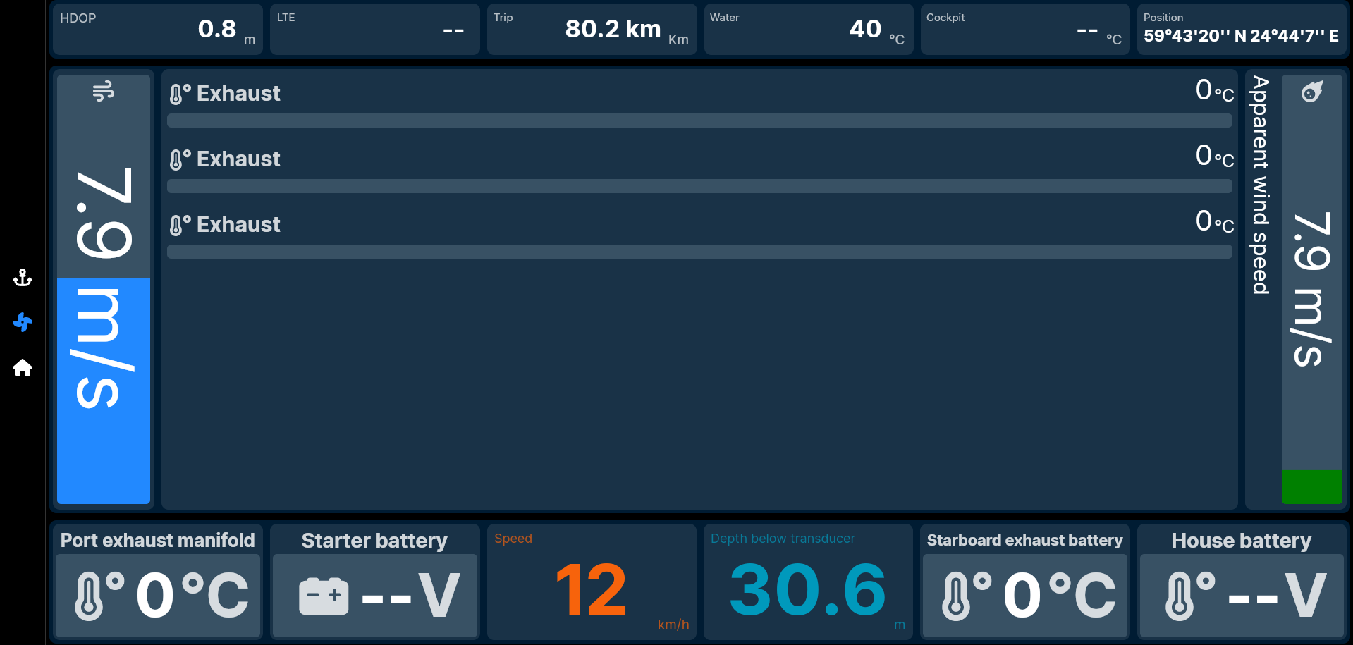
Layout Controls aren't "controls" like the Content Controls in the previous section of this document. But because they're placed on a Page the same way (and because, deep down in the programming of SKipper, they have a lot of other similarities), they're also called "controls". There are three types: Canvas, Grid, Stack, and Group. By using a combination of one, two, or all three of these types on a Page, you can create a very simple Page (a 2 x 2 grid, for example), or something very complex, like the example below.
Canvas
Canvas is layout that willows placing controls anywhere on the canvas and size them however you like. It's just like painter's canvas. Canvas allows controls to be overlapping. Each control can define border and it's style, like background color, corner radius (rectangle vs round rectangle) and padding thickness.
Control's on canvas position and size are relative to canvas size. So when you resize the SKipper window or rotate your phone all the onscreen controls will adapt.
When editing canvas will suggest places for new controls. When blank it will start with simple grid, but as you add few more controls it will start to repeat patterns defined by your first added controls. But if you don't like the pattern you can always move or resize control as you like.
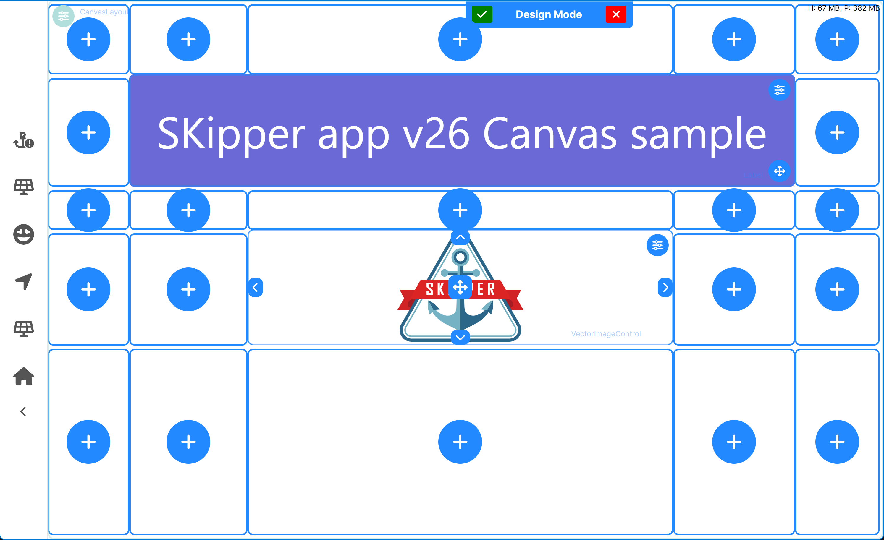
As you can see on picture above, whe you click on sizes-all button at the bottom-right corner of the control editor overlay you can start moving or resizing control. You don't need use just buttons with arrows, but basically all borders of the control editor overlay are working for drag and resize. The center of control acts as drag and move zone to move control anywhere you want. When you start moving or resizing controls you might notice snap lines showing near other controls these aren't mandatory and just help you to maintain some kind of distance between controls.
With canvas you can design pages that might consist of many elements. For example page with Map surrounded by other gauges, or even your boat's manufacturer's logo? No problem!
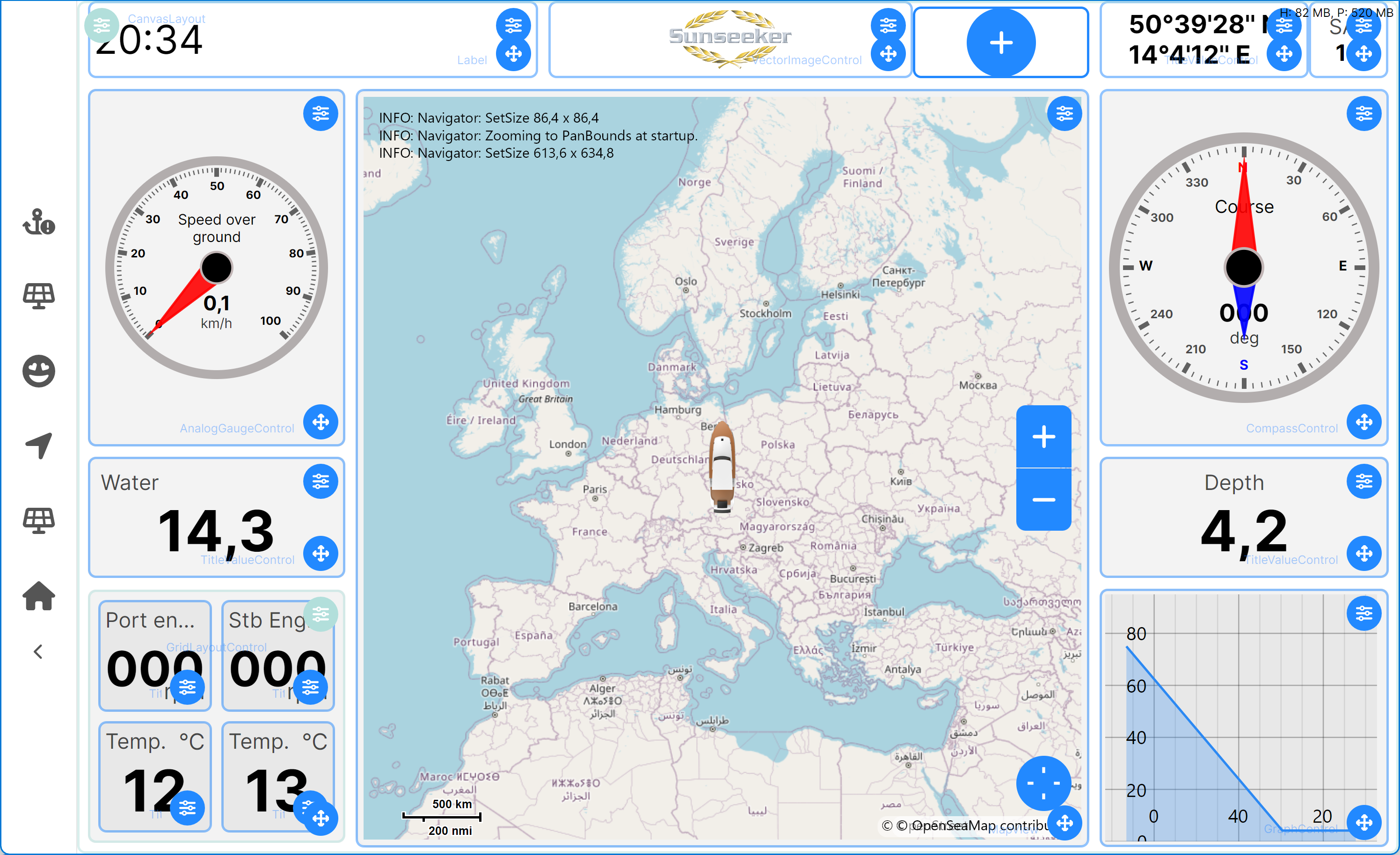
Use SKipper paste to download this shared page
Do you like this page? You can use SKipper paste with link or code V01KK to get it into your system. All you need to do is go to Home and Edit pages tap on menu (three lines) and choose Add shared page from friend.
With canvas you can also use other layouts and combine them in as other layouts are more suitable for other use cases, like Grid layout.
Grid
A Grid is defined by rows and columns. Row and column size is defined by a number that is proportional to the sum of the sizes of all the columns and rows. For example, in a grid with four columns with sizes 1, 2, and 1, the total Page width will be 4 (1 + 2 + 1 = 4), and the first column will be 25% of the width of the Page (1 / 4 = 25%), the second column will be 50% of the width of the Page (2 / 4 = 50%), and the third column will be 25% of the width of the Page.
A Grid layout will never be any bigger than the width and height of the Page, and the size of the Page is defined by the size and shape of your device's screen.
The image below shows one large 2 x 2 Grid, with each of the rectangles in the Grid further divided into a Grid. The top left rectangle is another simple 2 x 2. The other three rectangles are also 2 x 2 Grids, but with the proportional size of the rows and columns set differently to create very different Layouts.
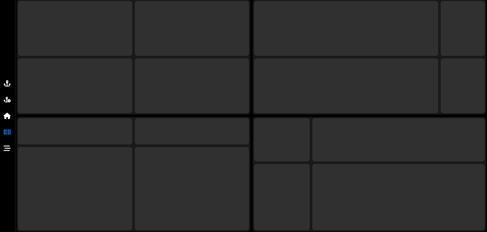
Adaptive grid layout
Beginning with v1.24.2, the Grid layout has a property called Auto Rotate. When enabled, the Grid will rotate to display properly in the new dimensions and orientation of the display (portrait or landscape) when you rotate the device. This feature allows you to create a Grid layout that will look great, whether your device is in portrait or landscape mode, with minimal effort.
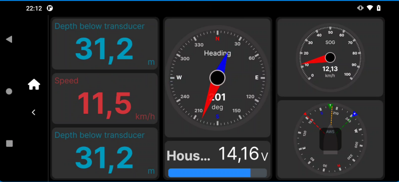
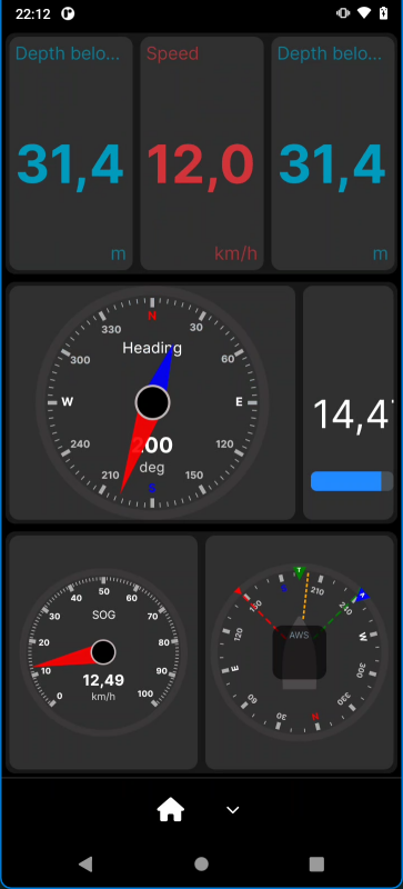
The following Grid was created on a phone in portrait orientation. The second image shows the same Grid after rotating the phone 90 degrees. Notice that the first column in portrait mode becomes the first row in landscape mode, the second column becomes the second row, etc. And each individual Control is rotated. This works even for Grids that are inside another Grid!
Here is the same Grid rotated.
Stack
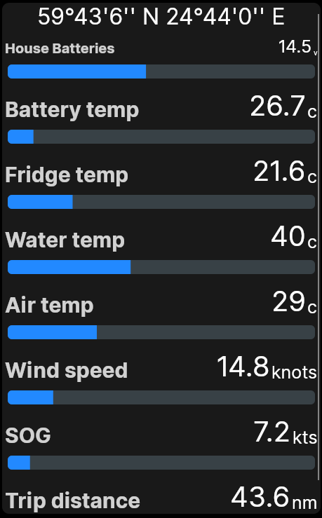
A Stack allows stacking Content Controls horizontally or vertically. If you put more Controls onto a Page than will fit, a scrollbar will appear so you can scroll up and down (or left and right for a horizontal Stack) to see all of them. The center of the complex Page Layout above is a Stack, currently showing three Exhaust Temperatures. You can see that there's still room for more data to be displayed in the space below them - maybe three more instances of the Exhaust Temperatures. But if you added six more instances, they could not all be displayed at once, so a scroll bar would appear to the right of them, so that you could scroll up and down to see all nine of the Exhaust Temperature Controls.
A great example of using a Stack is a Page defined for your phone with several Content Controls stacked on top of each other. You won't be able to see them all at once, but you can easily scan them all just by scrolling up and down. (Image below.)
Group
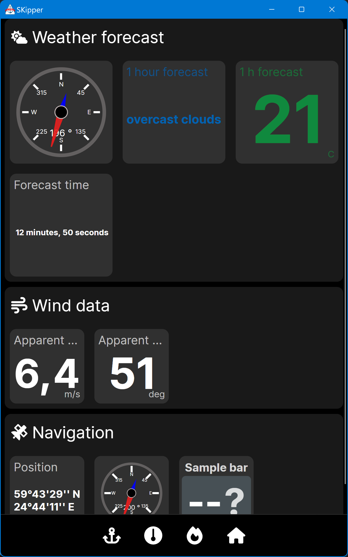
A Group can be added to any Stack to make a group of controls that will show in a grid-like layout. You can define the Group title and icon to better identify the contents of the Group - see the examples below. You can define the number of columns the Group will have, and the size of each Control in the Group will be adjusted so that they will fill the row. If you have more Controls in your Group than the number of columns, the additional Controls will wrap to the next line. The Weather Forecast Group in the image below is a three-column Group, but because there are four Controls, the fourth one wraps to a second line.
If you have more Controls than will fit on the Page vertically, you will get a scroll bar so you can see all of them. In the image below, you see that not everything in the three Groups (Weather Forecast, Wind Data, and Navigation) fits vertically, so there's a scroll bar to allow you to see it all.
That's why you always put a Group inside a Stack - so that you get the scroll bar if everything won't all fit on your screen.
By combining Grids, Stacks, and Groups, you can create Pages that display your data almost any way you can imagine! The only other thing you need to know about Layout Controls is how to use them, which is covered in the next section about Pages.