Controls - Advanced Topics
In Controls Overview, you learned the basics of each type of Content Control, and you've seen some of the settings you can change for each one to make them look just the way you want. In this chapter, we'll do a deep dive into each of the Content Controls, explaining every aspect of each one that can be customized. Nothing in this chapter is absolutely necessary - you can create a perfectly usable instance of SKipper without any of it. However, if you're going to get the most from SKipper, this chapter is required reading.
Zones
In Signal K, Zones can be defined for each Path that conveys a numeric value. Zones are part of the metadata for the Path, and look like this:
"zones": [
    {"upper": 30, "state": "alarm", "message": "Critically low - shut down!"},
    {"lower": 30, "upper": 50, "state": "warn", "message": "Low - investigate},
    {"lower": 50, "upper": 75, "state": "normal"},
    {"lower": 75, "state": "warn", "message": "High - investigate"}
  ]
This example is for a path like propulsion.mainEngine.oilPressure. It defines any oil pressure reading less than 30 as being an "alarm" state, with the message "Critically low - shut down!"; oil pressure between 30 and 50 as a "warn" state, with the message "Low - investigate"; between 50 and 75 as "normal", and above 75 as "warn", with the message "High - investigate".
NOTE: Setting up Zones in Signal K is beyond the scope of this SKipper documentation. Refer to the Signal K documentation, or ask about Zones in the Signal K Discord channel. When you have Zones defined for a particular path, you can then use those Zones in SKipper.
NOTE: Currently (SKipper ver. 1.0.21), each Zone must have both its upper and lower limit defined. In the above example of Zones, the first and last lines will work in Signal K, but not in SKipper. They would need to be modified like this:
Instead of:
{"upper": 30, "state": "alarm", "message": "Critically low - shut down!"}
it would need to be:
{"lower": 0, "upper": 30, "state": "alarm", "message": "Critically low - shut down!"}
where the "lower" limit is explicitly stated. So when setting up your Zones in Signal K, be sure to do this for any path you for which you want to use Zones in SKipper.
The best use of Zones in SKipper is for coloring some aspect of a Control green, orange, or red to indicate the current state of the Zones that are defined for a particular path (such as propulsion.mainEngine.oilPressure in the example above). See Controls - Data Converters for details.
Data Converters
Sometimes, you may want to show some data in SKipper that isn't easily available from Signal K, or isn't available the way you would like it to display. For those times, there are Data Converters built into SKipper that can convert data from its raw Signal K format to other formats that might be what you want. See Controls - Data Converters for details.
Control Details
Below, each of the types of Controls will be described in detail, including any properties about the Control that aren't obvious.
Button
A Button can be used to: - Send a PUT to a Signal K path (e.g., to turn the anchor light on or off) - Start some other program on your computer - Open any other Page in SKipper (although you would typically do that with that Page's icon on the Icon Bar) - Open any URL in a browser
The colors of a Button (text and background) can change depending on the value of a Signal K path - details below.
Here are all the Properties of a Button that are not self-explanatory:
Text
This will typically be static text that describes the purpose of the Button, such as "Anchor Light", or "Open SailorWx.com". You could, however, display the value of any Signal K path.
Icon
If you select an icon, it will appear to the left of whatever is in the Text field.
Foreground and Background Colors
By default, the colors are the same as the "Close" button that's at the bottom of the Button properties screen - white text on a blue background. You can change either one to a specific color, or you can use the value of a Signal K binding to set the color of either or both of these. For example, you could bind the background color to the path for the status of the anchor light. If the light is currently on, the color would be red, and if it's off, it would be green. (This will work only if you have Zones defined for that path, where 0 to 0 is defined as "Normal", and 1 to 1 is defined as "Alert".)
Interactivity (Click action)
Select one of the following Action Types, then complete the details:
- "exec" - provide the complete path to the executable program, and provide any commmand line arguments in the separate field.
- "put" - select the Signal K path to send the PUT to, and select what you want to send. The "Add" option will send an integer and add it to the current value of the path.
- "page" - select the SKipper Page that you want to go to.
- "openurl" - enter the url of the web page you want to open in your default browser, including the "https://" at the beginning.
ToggleButton
A ToggleButton is used to display the current value of any Signal K path that displays any form of boolean (true/false, 0/1, on/off), and toggles the value when clicked. The specific settings - many of which determine how the button will look - are detailed below (except the ones that are self-explanatory):
Value
This is the binding to the Signal K path that you want to display / control. It must be one of the boolean types (true/false, 0/1, on/off).
Style
- Button
- Switch (WARNING: don't use this in a Stack Layout - it looks horrible!)
- ToggleWithText
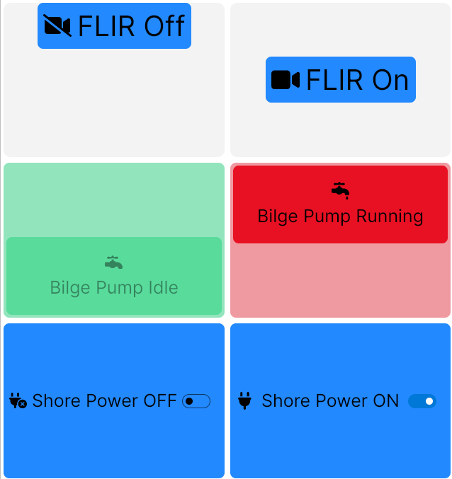
Each of these three styles is illustrated above. The top two buttons are the Button style, the middle two are the Switch style, and the bottom two are the ToggleWithText style. In addition, they illustrate some of the other properties of this type of Control:
Foreground and Background Colors
The middle pair of buttons above illustrates how these are used. See details in the Button section above.
Text-to-Icon Orientation
The icon can be beside the text (first and last pairs in the image above) or above it (middle pair).
Text Size
The top pair shows 40 pt. text vs. the default 25 pt. text on the other two pairs.
Active / Inactive Appearance
These are the text and icons that will be used when the button is in the Active (true / 1 / on) state, and the Inactive (false / 0 / off) state. Each of the pairs of buttons in the image above illustrates this.
Horizontal / Vertical Alignment
The default is for the button to completely fill the area allocated to it, as illustrated with the bottom two pairs in the image above. You can also have the buttons go to any corner of the area, or the center, as illustrated with the top pair.
Label
There is a good description of the Label Control here. Specific properties of the Label Control are either self-explanatory, or have been covered in the previous sections about Buttons and ToggleButtons.
TitleValue
There is a good description of the TitleValue Control here. Specific properties that are not self-explanatory or covered in the previous sections about Buttons and ToggleButtons are detailed below:
Title Alignment (Default appearance only)
If you choose the Default appearance of the TitleValue, you can determine where along the top of the Control the title will go. By default, it starts at the left side, but you can put it in the center, or send it to the right side.
Font Sizing
You can choose Auto-size, and SKipper will do its best to display the title, value, and units in appropriate sizes, with the emphasis always on the value. Or you can customize the size of all three of these fonts. The three examples in the image below illustrate (from left to right) the default sizes, Auto-sizing, and custom sizing.
The examples below also illustrate using a color for the text or the background, and using something other than the default "Stretch" for horizontal alignment.

HorizontalBar and VerticalBar
Everything you need to know about these two Controls is explained in the Controls Overview chapter.
Modern Compass
Refer to the image below to know how each bit of data is displayed on this Control:
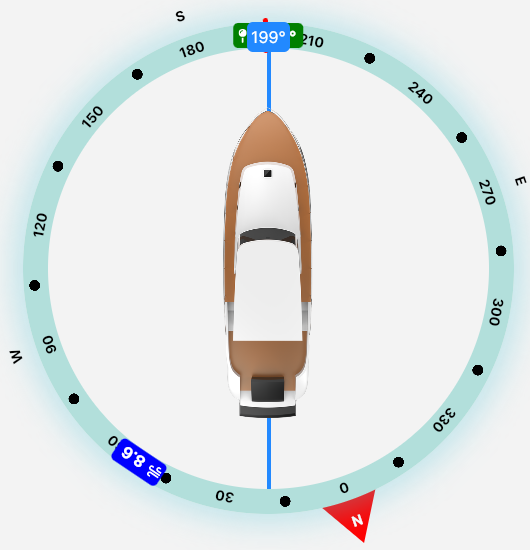
- Course Over Ground is the blue/white "199".
- Heading is the red line at the bow of the boat, mostly obscured by the blue/white "199".
- Next Waypoint Heading is the green square partially obscured by the blue/white "199".
- Wind Speed and Heading are indicated by the dark blue/white "8.6".
Note that you can hide the Next Waypoint Heading, and the Wind information, if you don't want to see them.
Graph (History)
A Graph displays a set of data pulled either directly from Signal K, or from InfluxDB (version 1 or 2) after it has gone from Signal K to InfluxDB. The set of data is called a History Data Set, and is defined separately from the Graph itself. So first, here's how to define a History Data Set.
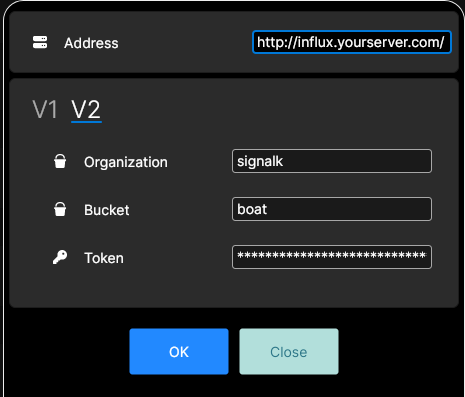
If you're going to be pulling data from InfluxDB, you have to configure that. Go to SKipper Home, then Settings, then InfluxDB Configuration. Complete the data in the image below, using your server address and credentials. Be sure the select V1 or V2 of InfluxDB: they are very different. The image below is for V2. From version v1.23 you can use button Load from server to quickly load InfluxDB configuration from your server.
To set up a new - or edit an existing - History Data Set, go to SKipper Home, then Settings, then "Manage history data sets". To create a new one, click the blue and white "+" icon in the upper right corner, and complete the information in the box that pops up:
"Name" should be descriptive of the data, and the time period covered by the data set (the "range"), like "Battery voltage - 7 days" or "Exhaust temp - 1 hour". This will be the default name of the Graph as well - but you'll be able to change that if you like.
"Binding" is the Signal K path whose data will be in this data set.
"Provider" is either Signal K or InfluxDB. If you choose InfluxDB, your Graph can display data from as far back as you have data in InfluxDB. But if Signal K is your Provider, the History Data Set will not contain any data prior to the moment that you create the History Data Set. Similarly, each time you start SKipper, a History Data Set that's based on Signal K data will start fresh with no data. In other words, if you create a History Data Set with a Range of 7 days, and the Provider of the data is Signal K, it will take 7 days to completely fill the set, and hence, the Graph. So if you want to see very recent data on a Graph, it's OK to have Signal K as the Provider. But if you want to see data that goes back in time very far (more than several minutes), consider setting up InfluxDB to store the data, then using that as the Provider for your History Data Set.
"Range" is the period you want displayed on the Graph. This can be from very short - 30 seconds for data that might be very volatile - to several days for data that is more stable.
"Display interval" is the amount of time between the data points in the History Data Set, and therefore on your Graph.
"Update interval" is visible only if your "Provider" is InfluxDB. It tells SKipper how often to refresh the History Data Set, and therefore the Graph. It should never be longer than your Display Interval. It's set in seconds, so even if your Display Interval is longer than a minute, set the Update Interval to 60 seconds. That will keep your Graphs current.
A History Data Set contains up to 1024 data points, which are, of course, the most recent data. With a longer Range, your Sampling Interval must be shorter, and with a shorter Range, the Sampling Interval can be longer. Some data changes very quickly, and a quick change is indicative of a problem, so you'll want your Sampling Interval to be short. For example, if you're monitoring the temperature of your engine's exhaust water, you'll want to know right away if it starts to increase significantly, as that's typically the first indication of an engine cooling problem. A Sampling Interval of 5 seconds would not be too short for this. But with only 1024 data points in a History Data Set, you can display only the most recent 85 minutes worth of data: your Range would be 85 minutes. On the other hand, the voltage of your house battery bank is unlikely to change very quickly, so a 10 minute Sampling Interval would be reasonable, giving you a Range of 7 days!
If you feel like you really need to see both the "high resolution" very recent past for some data, as well as its "low resolution" long-term history, the solution is simple - create a History Data Set and Graph for each one.
The Graph Control
Once you have a History Data Set defined, then you can define the Graph Control to display it. Below are the non-obvious properties for defining one.
"Title" will default to the name you gave the History Data Set that you're going to display on the Graph. So pick the History Data Set first, and then edit the Title only if you don't like the default name.
"Show Axis Labels" will display the time on the X-axis and the value on the Y-axis. You don't have to display them, but it would seem odd not to.
"Y axis starts with zero" - If you're displaying data that's never going to include a value of 0 (such as Battery Voltage - it's almost always going to be above 11 volts or so), then you probably don't want the starting point to be 0. That would waste a lot of the visible portion of the graph.
"Icon" - If you select one here, it will display in the very upper left corner of the Control.
"Show statistics (min, max, avg)" - Draws a dashed horizontal line for min and max, and a solid line for the average. (All of these are calculated from the data points that are displayed in the History Data Set - the "Range" - and do not include any other time period.)
"Enable line smoothing" will make the line on the Graph be slightly less "spikey", but it is strictly a visual thing - the data is exactly the same in the two Graphs below. The top one does not have line smoothing enabled, the bottom one does.
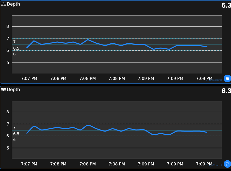
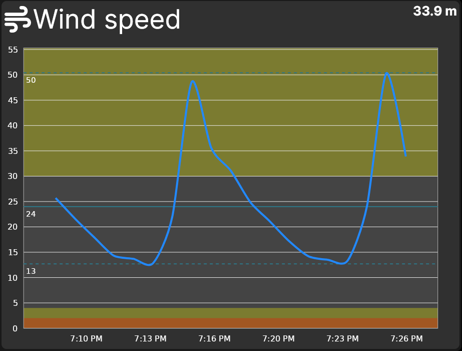
"Show zones" will display the defined Zones on the Graph, as in the image below. (Zones are defined in Signal K: SKipper only displays them.)
Digital Gauge and Analog Gauge
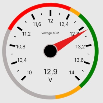
The only property of these two Controls that's not obvious is "Show Zones". If you have set up Zones for the Signal K path that you're displaying, they will show on the gauge, all the time, regardless of the current value of the path. So you will always see, for example, the Normal, Alert, and Alarm ranges on the gauge, as in the image below.
Wind Gauge and Compass
When you set the binding for each of the five data boxes on the Wind Gauge, put a 0 (zero) in the "String format" field, so that you get data like "120" and not "120.6".
Everything about these two Controls should be self-explanatory.