Controls - an Overview
Each Page in your SKipper UI will consist mostly of Controls - they are the main graphical components of SKipper. Content Controls display Signal K data, and Action Controls allow you to make something happen. There are also Controls that don't display Signal K data - they are used simply to enhance the appearance of your UI. This chapter will introduce you to each of the Controls, so you can decide which of them you want to use. In another chapter, we'll get into the details of how to add each type of Control to your UI.
Control Size
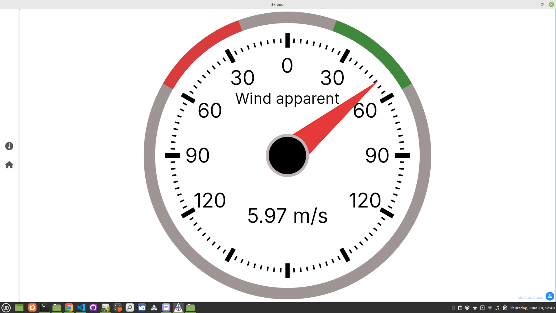
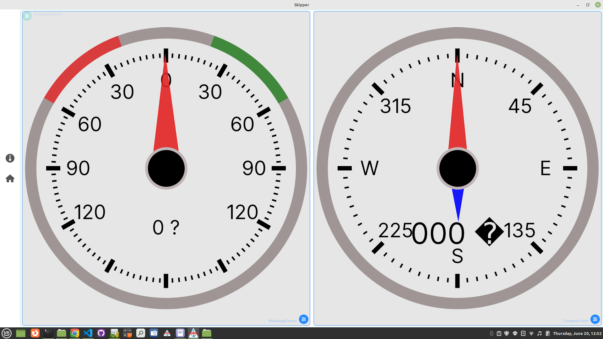
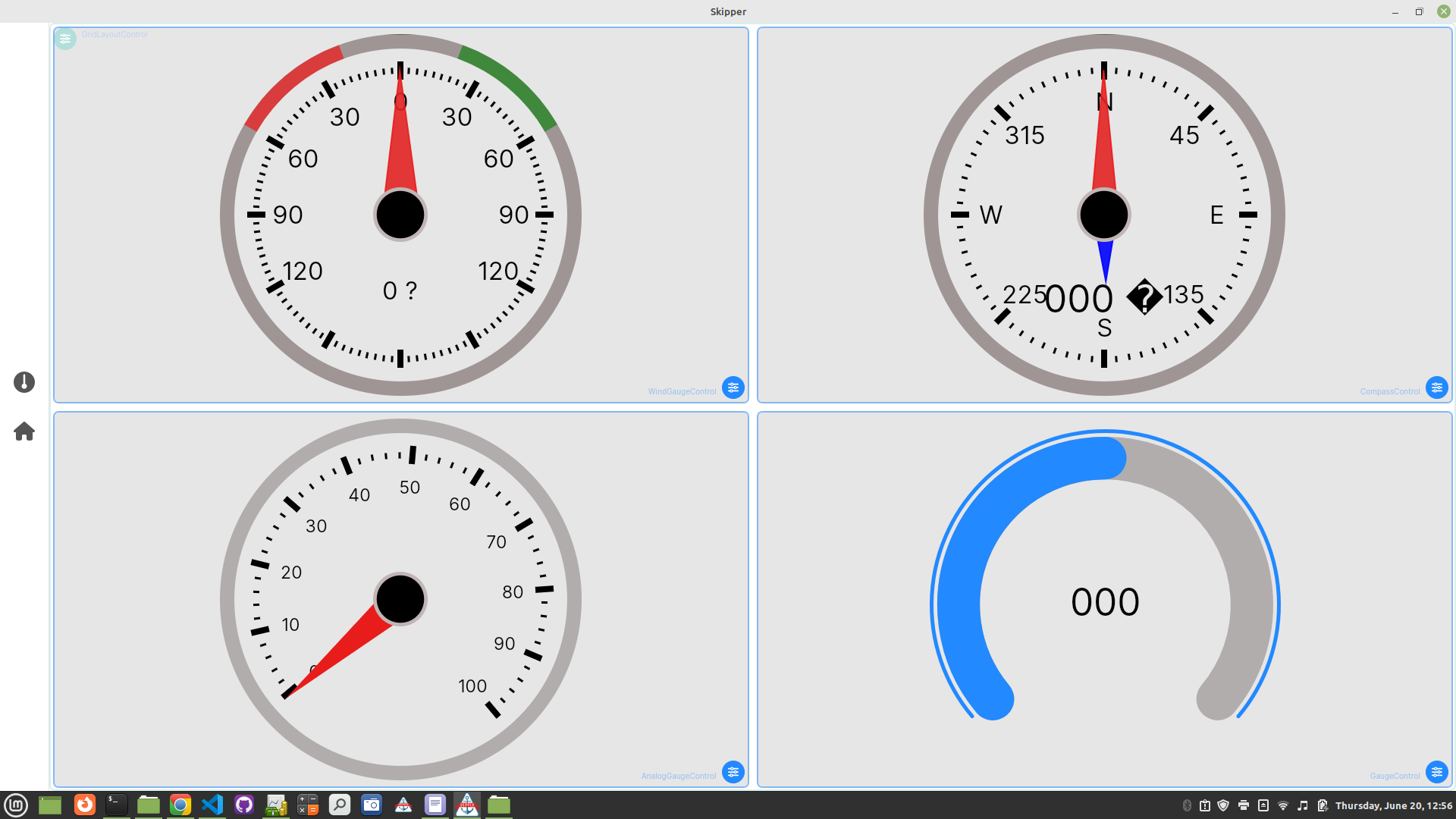
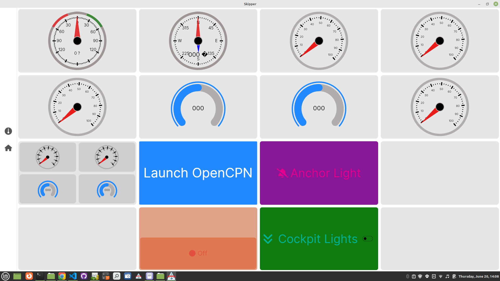
Each Control will be placed into a specific place in a Layout (covered in the next Chapter), and it will use as much of the space you allocate for it as is practical. The next four images illustrate this: the first shows a Wind Gauge Control taking up the entire screen; the second shows a Wind Gauge Control and a Compass Control sharing the screen; the third shows four Round Gauges sharing the screen; the fourth shows how small the Controls get if you put a lot of them on a Page. This is important when designing your Pages - you don't want to put too many Controls on a Page, or they might be too small to read - especially when designing Pages for a small device such as a phone.
Action controls
Action Controls allow you to initiate an action. There are two of these: Button and Toggle Button, and you can modify the color, icon, font size, and text for each one.
Button
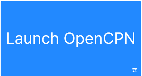
With a Button Control, you can initiate any of these actions:
- Signal K PUT request. You can define a Signal K path and value that will be sent in the PUT request. The value can be True, False, a number, or a string, or it can modify an existing value by adding a number to it, or by toggling a boolean or 0/1 value.
- Go to a specific Page in SKipper.
- Execute a command to the operating system. (Only on Linux, MacOS, and Windows.)
- Open a page in a browser.
- Autopilot control. Allows you to control your autopilot via the Signal K v2 Autopilot API - tested with Pypilot and Autopilot plugins. There is a Page template available for autopilot control with some pre-defined Button Controls to do the most common autopilot tasks. (See more details below.)
- Anchor alarm control. This action can control the Signal K Anchor alarm plugin. You can lower and raise the anchor, and set the radius for the anchor alarm. (See more details below.)
- SKipper actions. You can run SKipper app actions to Toggle theme, Set dark/light theme, go to Home, Settings pages, Run user defined quick action, Toggle icons bar and Load or Save the UI! Is there some other SKipper action that you would like to initiate with a Button? Let us know at SKipper support page!
When creating a Button Control to initiate some action in a Signal K plug-in (such as the Autopilot or Anchor Alarm), you'll select the name of the plug-in as the "Click action" for the Button. Then you'll be presented with a drop-down list of all of the actions available for that plug-in. In the example below, the selected plug-in is "autopilot", the "action" is "Tack", and the direction of the tack is "Port".
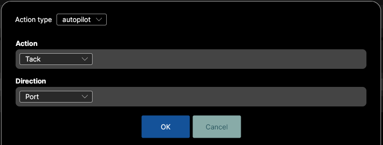
After you select the "Click action" for a Button, you have the option of enabling a confirmation, to prevent you from doing something accidentally that could cause a real problem, such as dropping the anchor while you're underway.
Toggle Button
The Toggle Button allows you to toggle the value of a Signal K path whose value is a boolean (true/false/0/1/yes/no). The current value of the path is shown, and it changes each time you press or click the Toggle Button. There are three styles of Toggle Button:
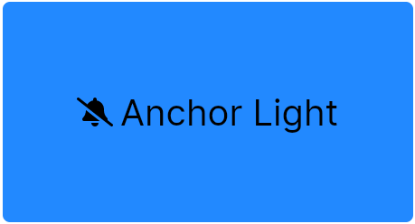
- This is the default. The icon can change depending on the state of the boolean value of the path.
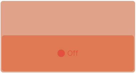
- Switch (like a wall switch). When off, the bottom half is dimmed, and when on, the top half is in full color.
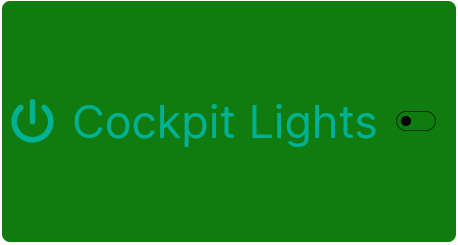
- Toggle with Text. It shows the icon on the left, text in the center, and a toggle to indicate the current state on the right.
Content controls
Content Controls provide various ways to display Signal K data.
Label
The Label Control gives you a way to provide a text label to your entire Page, or to any section of your Page. It can display one item of information from Signal K (for example, the boat's Lat/Long position), or static text. You can change the text, foreground and background colors, font size and weight, and you can enable or disable word wrap. A Label is great way to add helpful information to your Pages, as in the examples below. You can even display different colors for the data depending on the value of the data; for example, red text on a yellow background if the temperature being displayed is too high!
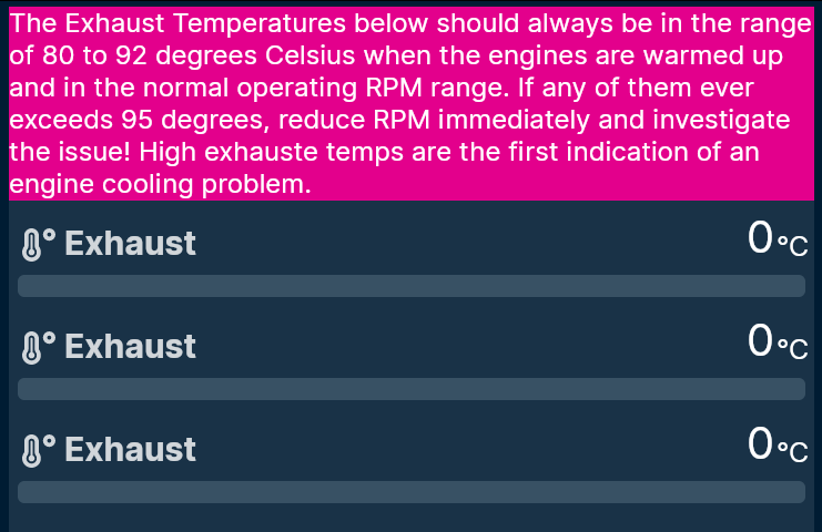
Above, the text with the pink background is a static-value Label. Below, the top pair of Lat/Longs is displayed with a Label. The second pair of Lat/Longs is displayed with a TitleValue Control, described below. The main difference is that the Label shows only the Lat/Longs, but the TitleValue also displays the title of the data being displayed: the word "Position".
TitleValue
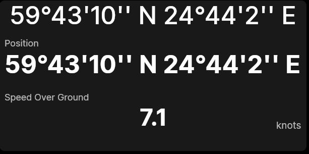
The TitleValue control displays one, two, three, or four things at once: data from one Signal K path (always displayed), a text title, the units in which the data is presented (text of your choosing), and min/max values. To hide the title or units, simply make those fields blank. To hide min/max values, select any "appearance" other than WithStatistics. You can define the foreground and background colors. You can define the font size for the title, value, and units (the font for units is also used for min/max value), or you can choose AutoSize for the fonts. In the image above, the second pair of Lat/Longs is a TitleValue showing just the title and the value, but no units. The bottom Control, showing Speed Over Ground, is also a TitleValue, but it's showing title, value, and units.

TitleValue Default appearance shows the title at top left, units at bottom right and value in the center. It's great to be used in a Grid Layout when the space for the Control is approximately square, or if it's not at all crowded. There's also a "one-line" option that shows the same information in the same basic positions, but flattens it vertically. It's great to use any time you want to minimize the height of the Control, or in a Stack Layout with several other one-line TitleValues. (Example below.)
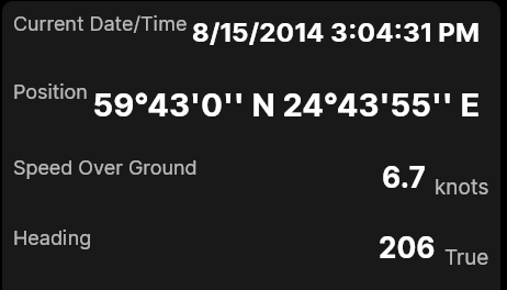
TitleValue Compact appearance shows the title and units at the top and value in the center, so it's a little more compact, vertically, than the Default appearance.
TitleValue WithStatistics appearance is like Compact, except the value is in a smaller font and the min/max values are at the bottom, in the same font size as units.
HorizontalBar
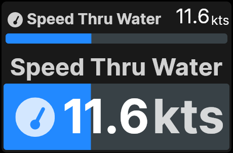
The HorizontalBar Control displays an optional icon, optional title, value, and optional units, plus the "progress bar" that shows the value between the minimum and maximum set by the user. The color of the progress bar can be tied to Zones in Signal K so that it's a different color depending on the value.
HorizontalBar has two different styles: Default and Filled. The Default style shows the icon, the title, and the value along the top, with the progress bar and the units on the bottom. The Filled style shows only the title on the top, with everything else on the bottom. The icon, value and units are auto-sized to fit the available space in the progress bar. The image below shows the same data displayed in both styles.
Starting with version 1.24.3, the title can be hidden by setting Title Visible property to false. (If you show an icon, you may not need a title, so hiding the title allows all the space to be used for the bar and value.)
VerticalBar
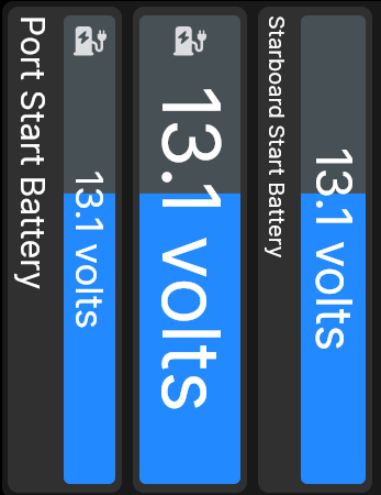
The VerticalBar Control shows an optional icon, optional title, value, optional units, plus the "progress bar" that shows the value between the minimum and maximum set by the user. The color of the progress bar can be tied to Zones in Signal K so that it's a different color depending on the value.
Below are three variations of the VerticalBar: on the left, the title is shown in the default font size; in the middle, the title is hidden, so the progress bar fills the space; on the right, the title is shown, but in a smaller font, and there is no icon.
Modern Compass
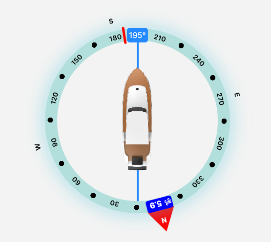
The Modern Compass combines a lot of information into a single graphic display: Course Over Ground, Heading, Wind Speed and Wind Heading, and Next Waypoint Heading. (If you don't have all of that info in your instance of Signal K, just use as much of it as you have.)
Graph (History)
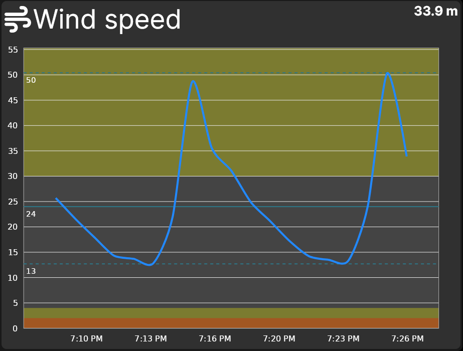
The Graph (a.k.a. History Graph) Control is one of the most useful of all the Controls, as it shows not only the current value of any Signal K path, but also the recent history of that path. For critical data such as certain temperatures, pressures, voltages, etc., no other Control allows you to know, at a glance, that a particular bit of data that you're monitoring is either "OK" or "not OK".
Data can come directly from Signal K or from InfluxDB (version 1 or 2). A Graph can display up to 1024 data points, allowing you to display, for example, house battery voltage every 10 minutes for the last week, or engine exhaust water temperature every 3 seconds for the last 85 minutes. If you have Zones defined for the path, they will be displayed on the graph so you can easily see if any data in your history is out of the normal range. You can show lines for Min, Max, and Avg during the time period displayed, and make many other visual customizations to this Control.
Digital Gauge
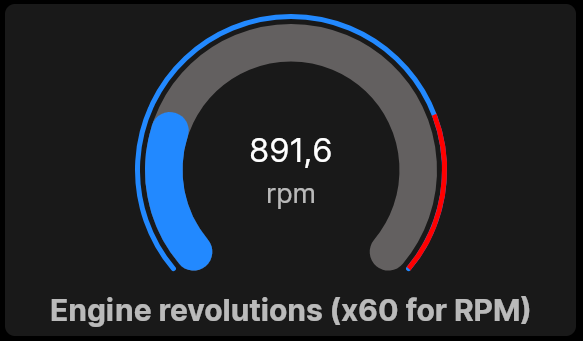
The Digital Gauge Control displays a numeric value in a modern arc-style gauge. The arc indicates the current value between user-defined minimum and maximum values. The Digital Gauge shows an optional title, optional minimum and maximum points on the arc, optional units, and the value. The color of the arc can be tied to Zones in Signal K so that it's a different color depending on the value.
Analog Gauge
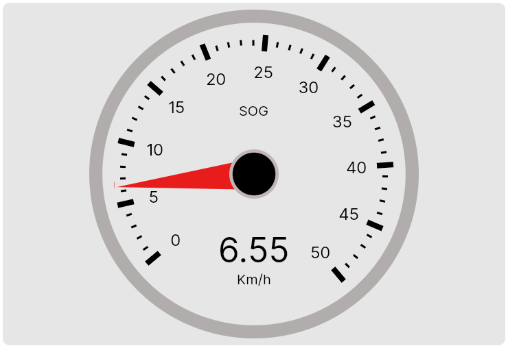
The Analog Gauge display a number from Signal K in the form of a circular gauge with a needle and tickmarks, emulating typical real-world analog gauges. It can display an optional title and units. Minimum and maximum values are user-defined, as is the color of the needle. The colors of the circle can be tied to Zones in Signal K so that each segment of the gauge is in a different color. Font sizes are set automatically.
Wind Gauge
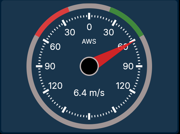
The Wind Gauge shows wind direction (true and apparent), heading, COG, and next waypoing graphically. In addition, you can also show up to five items of digital data in the five data boxes, which can be any data you want.
Compass
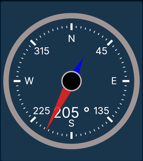
The Compass shows magnetic or true heading. The title is user-defined, and the font sizes are set automatically.
Liquid Gauge
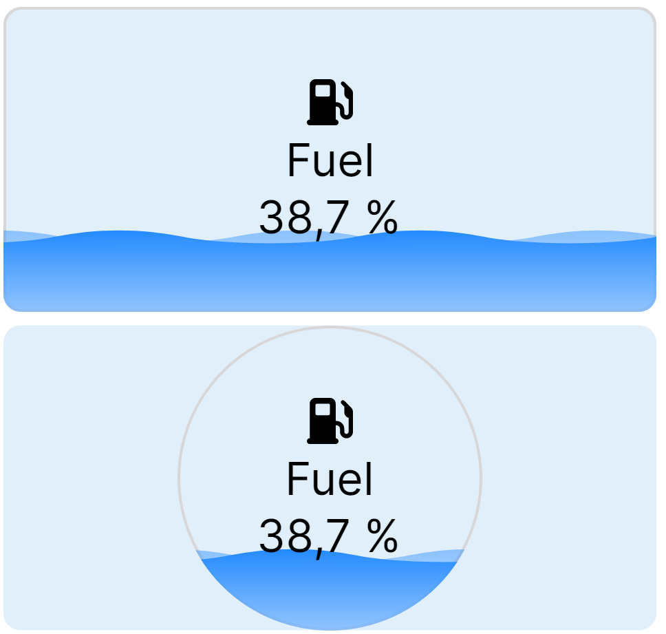
The Liquid Gauge allows you to present the state of a liquid tank with a cool liquid-like animation. The icon, title, minimum and maximum values, as well as the Signal K path binding are all user-defined. You can also choose a Rectangular or Circular gauge.
Vector Image
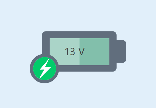
Added in version 1.25, a Vector Image Control is basically a very special image (or multiple images) that you can "program" with a SKipper Instruction. Below is a very basic example. Click here for complete documentation.
Video Player
The Video Player can play videos directly on a User Defined Page.
Layout Controls
Layout Controls are very different from all of the Content Controls described above. They simply allow you to define the organization of each page - its "layout". You add them to a Page the same way that you add any of the Content Controls to a Page, but that's the only way they are similar. The next page of this document explains Layout Controls.