SKipper Instructions
Introduction
Instructions are a new feature in v1.25 that allows you to "program" the behavior of SKipper in many ways. Initially, there are two uses - adding various "behaviors" to an SVG image as a way to create very graphical Controls, and modifying some parts of existing Controls to give you more and better information. In the future, Instructions will be used to enhance existing SKipper features, and to create new ones.
What is an Instruction?
An Instruction is a way to create a basic "if-then statement". A very simple example: you could create an Instruction that will display the word "DEEP" in place of the actual depth of the water, if the water depth is more than 100 feet. That way, you don't waste any time interpreting whether the currenly-displayed number is deep enough for your boating activities - you know it is, because it's DEEP! In the examples below, you'll see better real-life uses, but all of them follow the same basic pattern: if some value from Signal K meets some criteria, do something in SKipper.
Using Instructions with the Vector Image Control
A Vector Image Control displays one or more SVG images on the screen. Images can be anything from a boat maker's logo, a weather icon, or even your own system dashboard that will show system status, energy flows, fluids status, engine status, almost anything! And with one or more Instructions, you can turn the SVG image(s) into a very functional, very graphical, Control. You can click/touch a region of an image to make something happen (a PUT, an "exec", etc.). You can display one or more values from Signal K on an image. You can make all or part of an image change its appearance based on some value from Signal K.
A Vector Image Control needs a special type of SVG - one or more region of the image must be defined and given an ID. You can create your own SVG or your can download one from the Internet - there are countless images available. If the image doesn't have any region ID's, or you want it to have more, you can modify it to suit your needs. In this example we'll use a free SVG from Freepik to show a battery's status. And we'll modify it using a nice, free, SVG editor called Inkscape.
Note About SVG Images
SKipper can modify only SVG elements that have an SVG ID attribute set. Any element without an ID won't appear in the Instructions editor. If you don't see an element in the editor, it's most likely due to that element not having an ID. This can be fixed in an SVG editor like Inkscape, as you'll see below.
Prepare The SVG
Open the SVG file in your favorite editor - this example uses Inkscape.
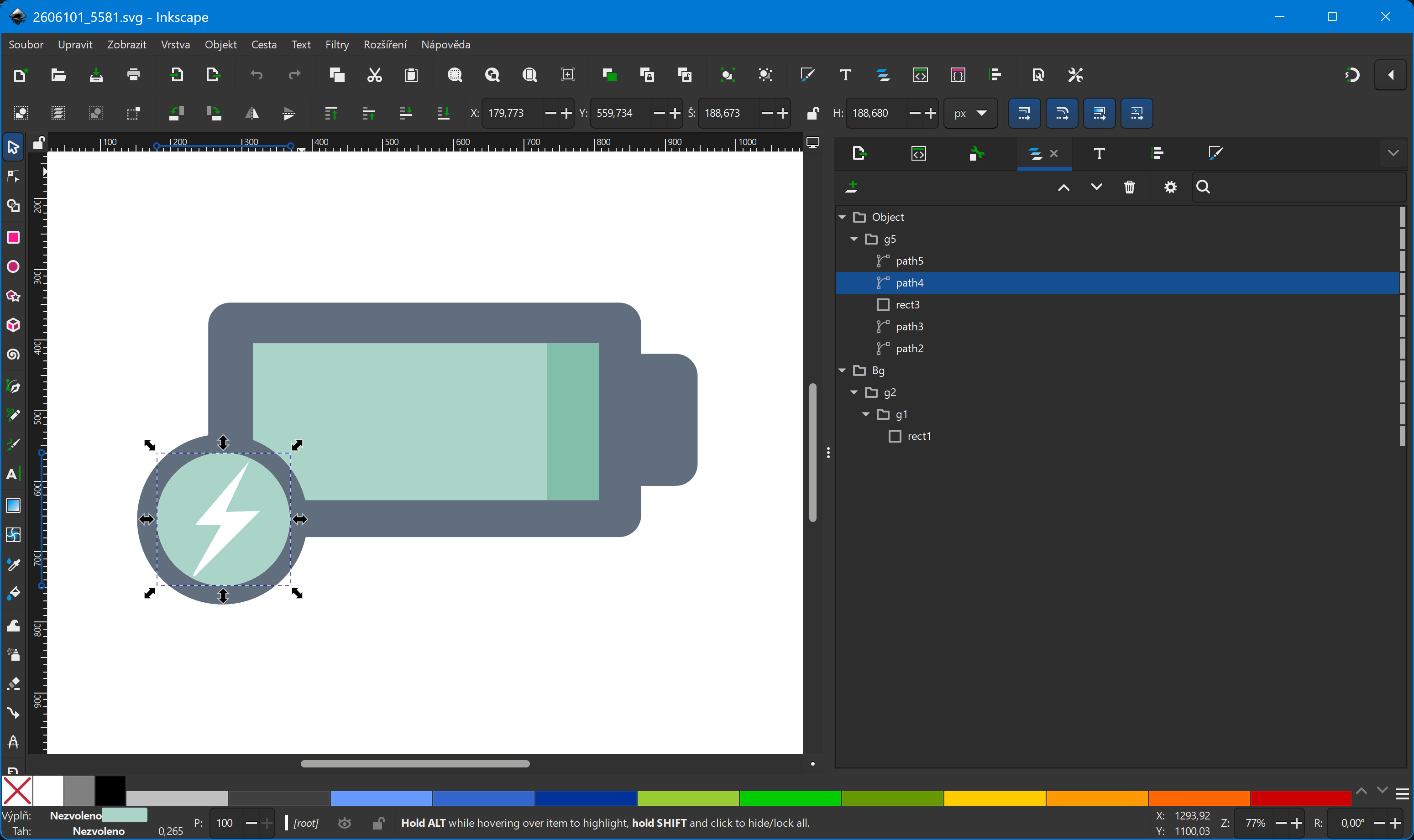
You can see the SVG's layers and objects in a hierarchical tree. In our example, we want to see battery voltage and charging status. To display the actual voltage, add a text SVG element with 'xx.x V' as the text, and set the ID of the SVG text element to voltage.
Click on the "rect3" SVG rectangle element in the tree, then move and resize it to fill the entire green area.
The editor should look like this:
Write down the width of "rect3" somewhere. It's 490 image points. We'll need this later.
SKipper can't resize SVG paths, only SVG rectangles, so delete "path3". Then duplicate "rect3", move it right below the first "rect3", and make it fill the whole green space. Change the fill color to #82bfabff, and give it ID voltagebar. Now we have two rectangles - one that will always be dark green and will fill the entire rectangle, and one that will be lighter green. Its width will change to reflect the charge level, and as it gets wider, it will cover up more of the dark green, so we'll have a nice graphical indication of the state of charge of the battery. (We'll add the Instructions to do all of that below.)
The green circle behind the flash should have a meaningful name, so change the "path4" ID to voltageindicator. We're going to use a SKipper Instruction to change its color to indicate the battery state (charging or not) depending on some Signal K data. Save the updated SVG, and it's ready to be imported into SKipper.
Add a Vector Image to a Page
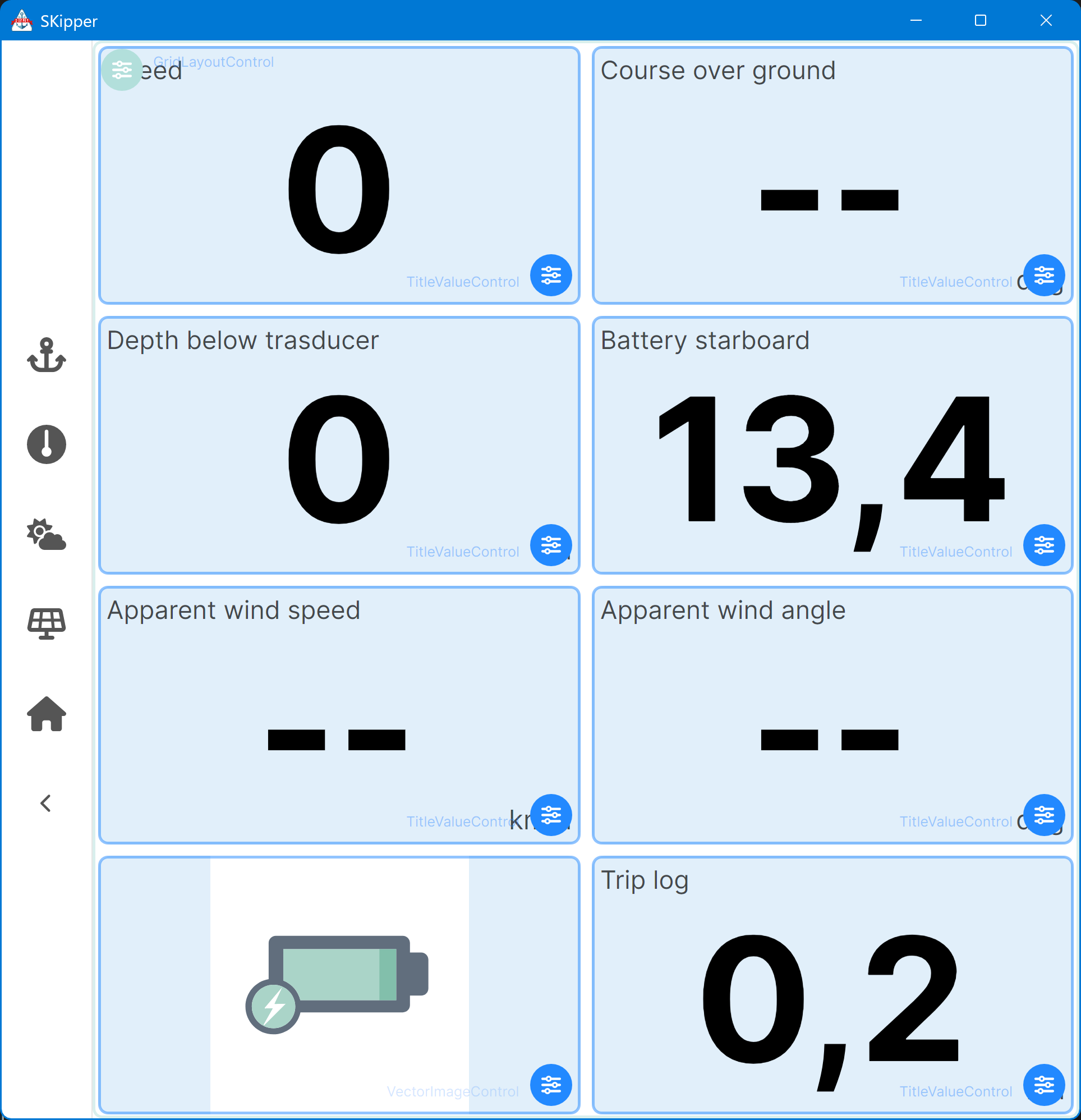
Create a new user-defined Page, or navigate to a Page where you want to create your shiny new battery status gauge.
Add a new Vector Image Control onto the Page. (Don't you know how to do that? See Creating pages.)
The Properties for the new Vector Image Control appear. "SVG source" is the image. Download your SVG file onto your device, then click on "Select Vector image", navigate to the file's location, and select the file. Make sure "Stretch to fit" is "On", so the image will fill the entire space of the Control.
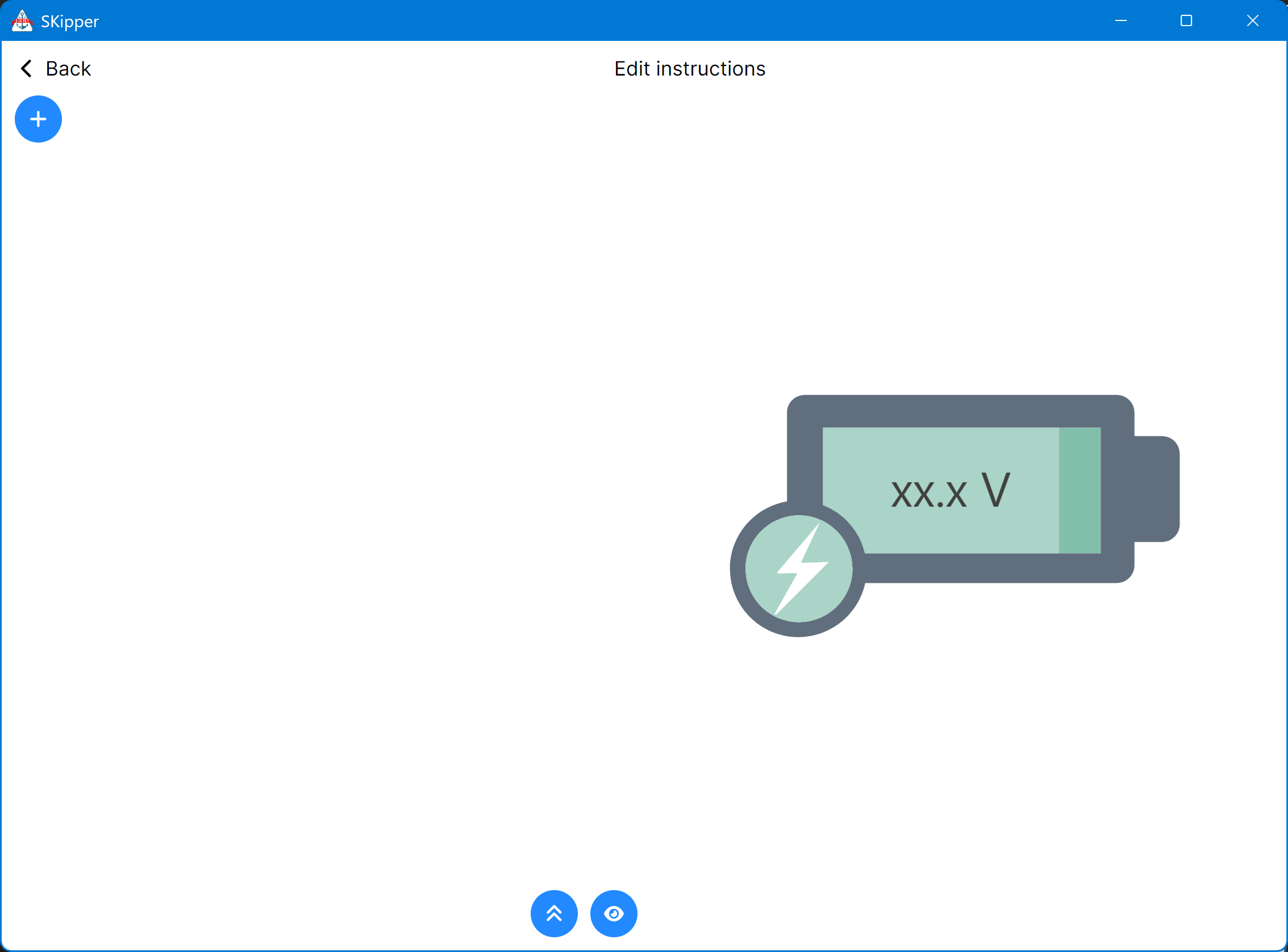
Close the Properties and you should see a new Control, with just the vector image in it. Something like this:
It looks great, but it doesn't do anything yet. We'll fix that now. Click the little blue "settings" icon in the lower right corner to bring up the Properties for this Control. Then click the "Edit Instructions" button.
The Instructions editor appears, but it's empty except for a few buttons. The blue "eye" button at the bottom of the editor will give you a preview on horizontal devices like a PC, Raspberry Pi, or tablet. Every time you click on it, it will update the preview, so you can edit your Instructions and instantly see the result. Click it now, and the SVG image appears.
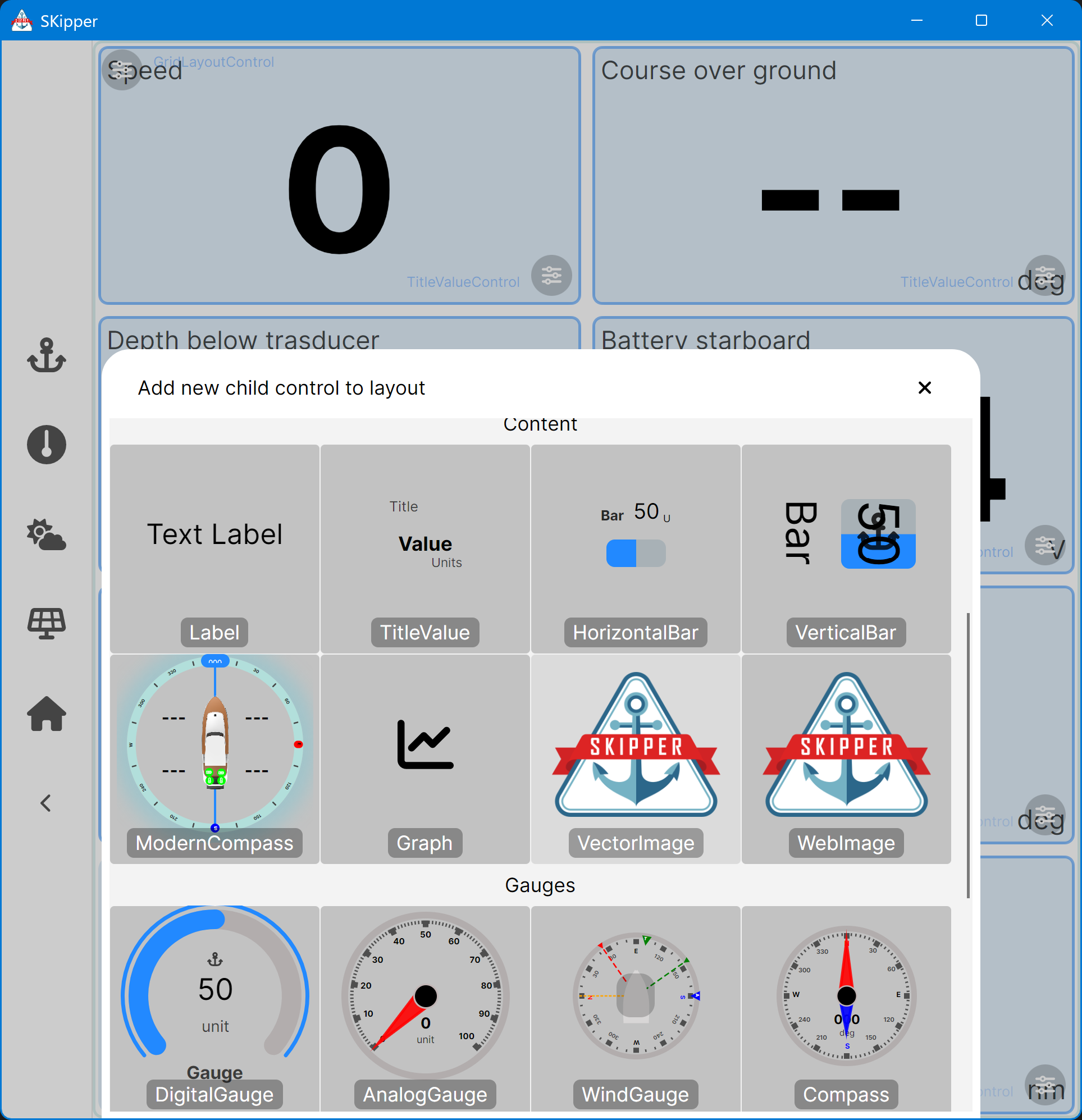
Add the first Instruction by clicking on the "+" button at the top left corner of the editor. A menu appears, listing all the types of Instructions you can add at this point. (See below.) Look at all of the Instruction types, to get an idea of all the things you can do with Instructions.
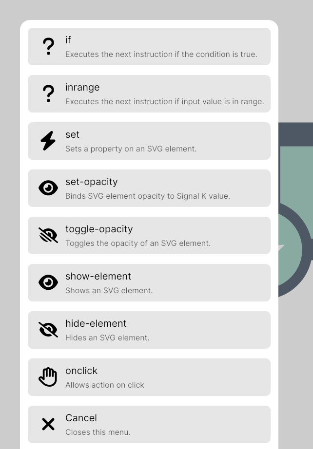
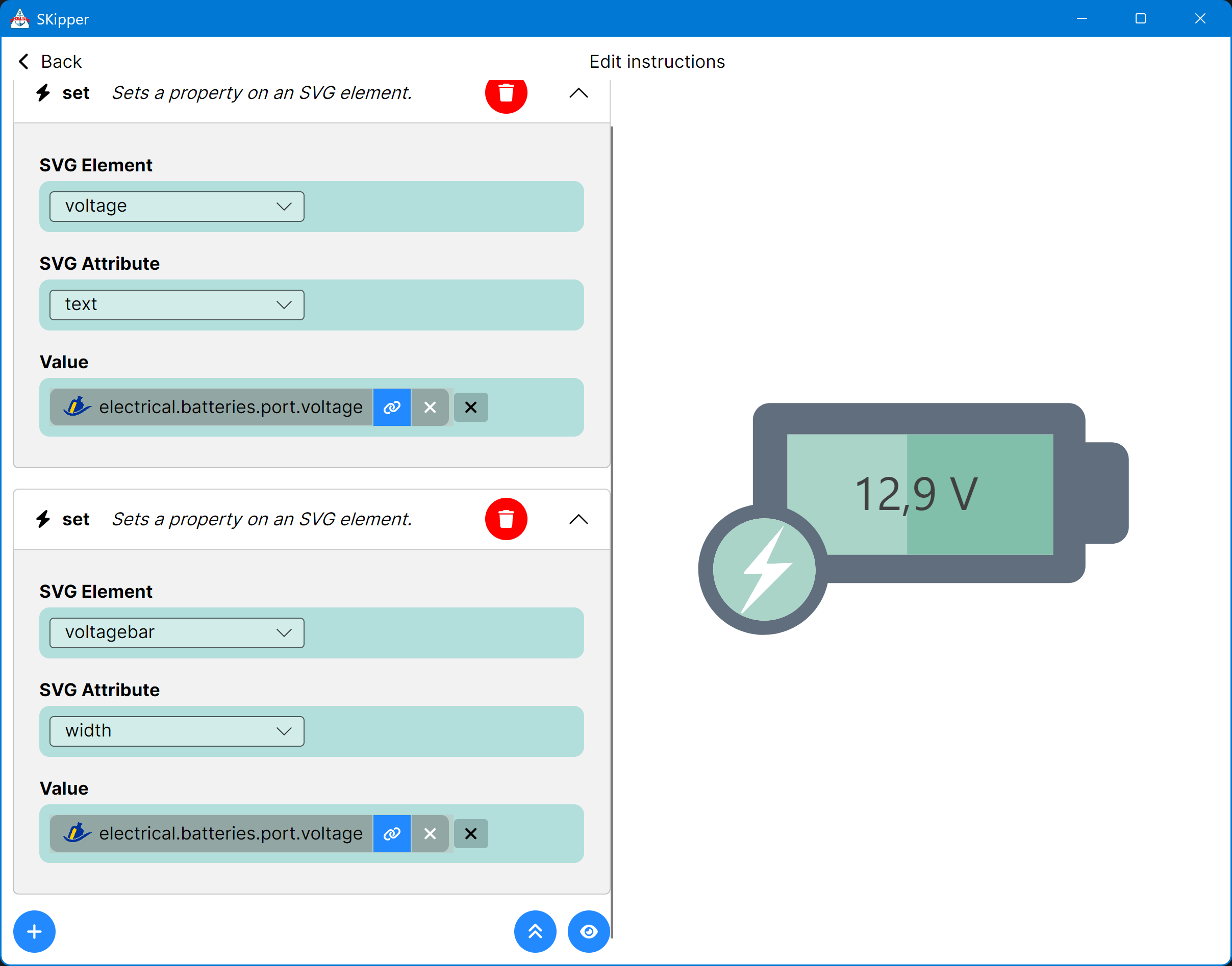
Select "Set" - that's what we need for this part of our example. Now the Properties page for a "Set" Instruction appears:
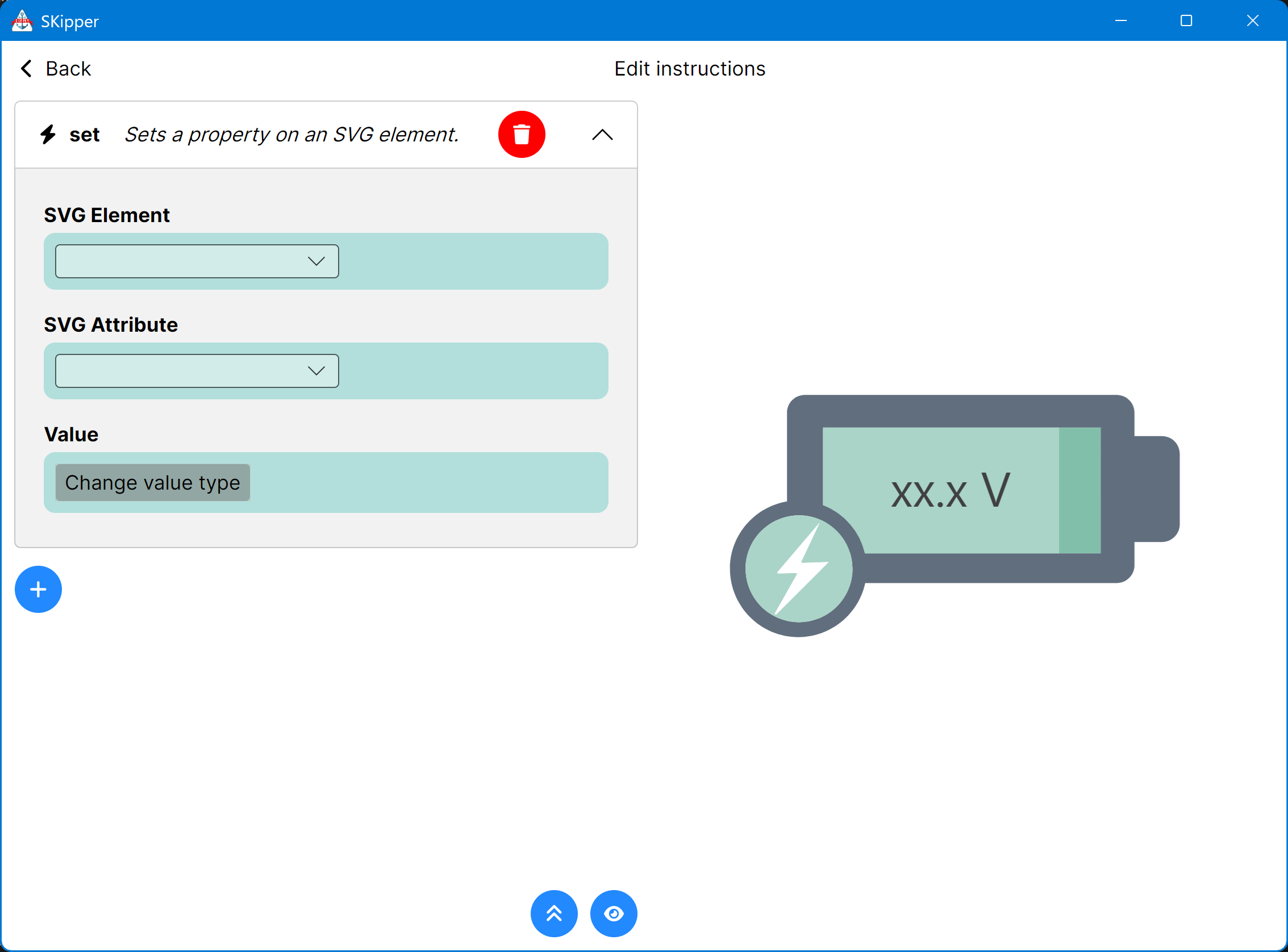
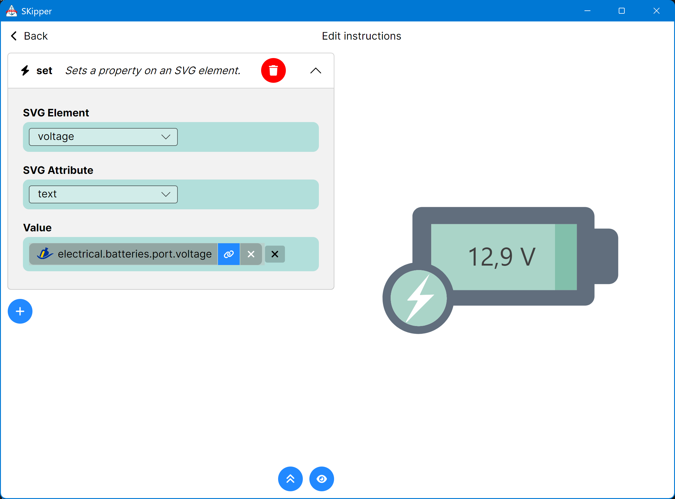
The SVG Element is voltage - that's the ID we gave to the text box, when we were editing the SVG above. The SVG Attribute is text. The Value will come from Signal K, so its type is "Binding", and the path is whatever Signal K path you want to display here (such as electrical.batteries.port.voltage).
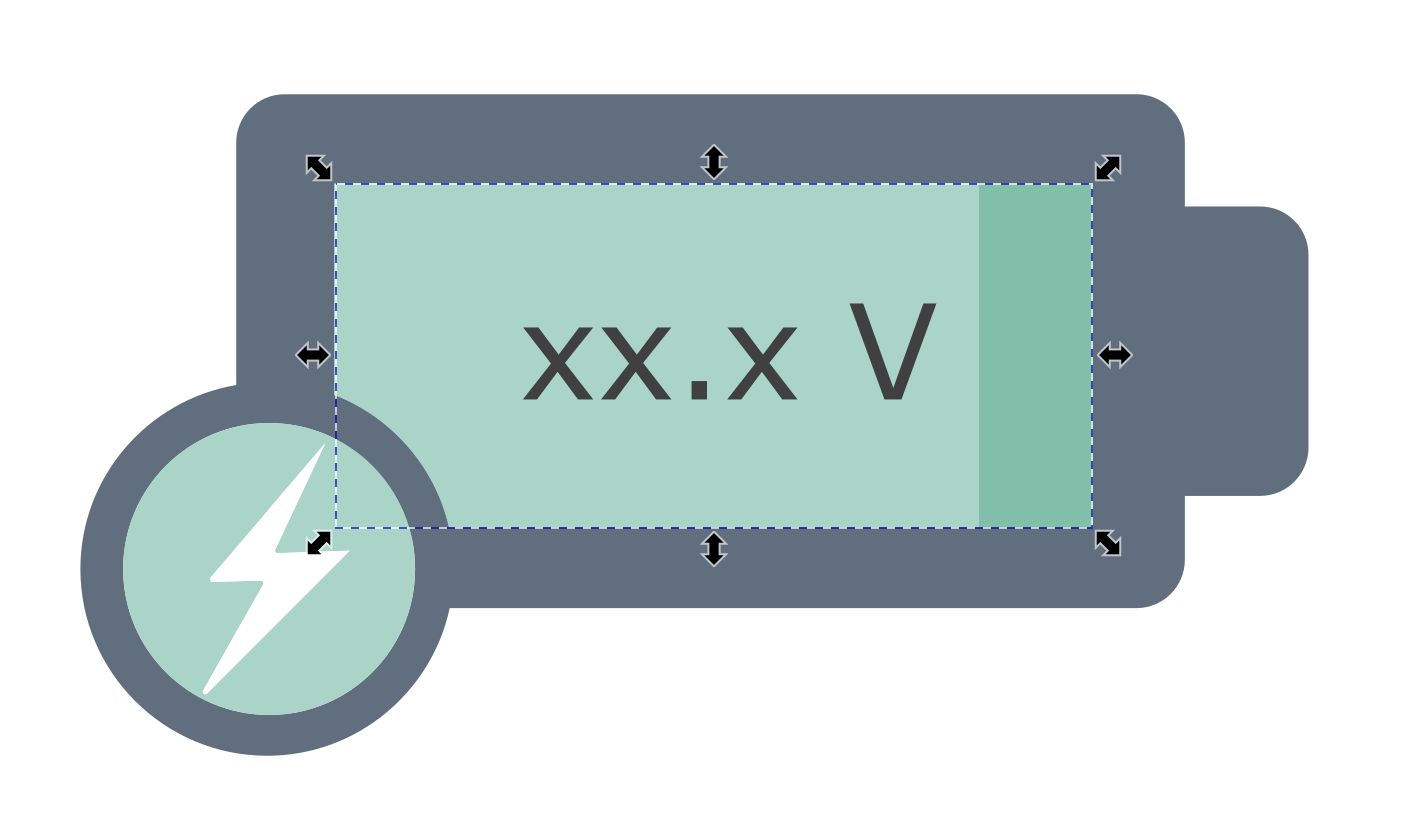
If you're doing this on a computer or tablet, you can click the preview button (the eye) and this should appear:
That's a good start, but now let's change the width of the light green bar depending on the battery voltage. Assume the minimal voltage is 11.5 and the maximum is 15.0. Do you remember the width of the rectangle? It's 490. So we need to create a binding that will compute 0 when the voltage is 11.5 and 490 when it's 15.0.
Add a new "Set" Instruction by clicking on the little "+" button. Select voltagebar as the SVG Element, and width as the SVG Attribute. Change the Value to "binding" and bind it to the same battery voltage path in Signal K. But to convert a range of 12 to 14 into a range of 0 to 490, we need to set the "Offset" to -11.5 and the "Multiplier" to 140. (The Offset is applied first, so a voltage of 11.5 becomes 0.0, and 15.0 becomes 3.5. Multiplied by 140, you get 0 and 490, which covers the entire width of the rectangle.)
Click the preview button and it should change the bar width to correspond to the voltage that's being displayed as text.
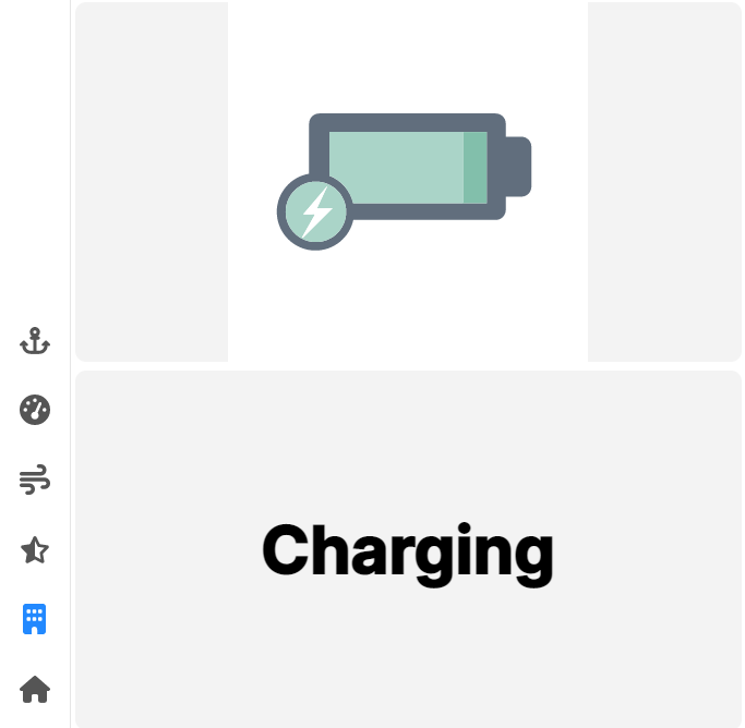
Finally, let's change the color of the circle behind the flash to green when the voltage is in range of 12.4 - 12.8, yellow when the voltage is below 12.4 and blue if the voltage is higher than 12.8 (to indicate "charging" or fully charged).
We'll use a type of Instruction called in range, which allows you to run other Instructions when a value from Signal K is within a defined range. Click the blue "+" button, then select "Inrange", and the Inrange Properties will appear.
Set the Signal K binding to the same battery voltage path you've been using so far, set the Operator to "InRange" and set the range limits to 0.0 and 12.4. That defines the condition that must be satisfied for this Instruction to execute. Now, we have to define what's going to happen when it's satisfied.
Click the "+" button right under the Range to Match, and add a "Set" Instruction. The SVG element is voltageindicator and SVG Attribute is fill. The only Value Type offered will be "Color", so click that, and then select some shade of yellow or orange, as this will be a warning indicator.
Now add two more in range Instructions: one with the range 12.4 - 12.8, set to green, and one with 12.8 - 15.0, set to blue.
(NOTE: if more than one Instruction would modify the same SVG ID, it is the last one - in the top-to-bottom list of Instructions - that will prevail. In our example above, a value of 12.4 would resolve to green, even though both the green and the yellow Instruction are satisfied, because the yellow one comes first, which would change the color to yellow, but then the green one is next, and it immediately changes the color to green. So be careful about the sequence of your Instructions if there's a potential for more than one of them to modify the same thing.)
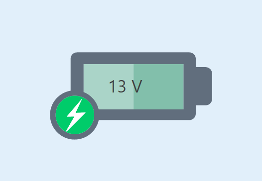
When you're done, your cool new battery gauge should look like this:
If you want to see more ways to use the Vector Image Control with Instructions, create a new user-defined Page from the template called "Solar Charging Status". It has 3 different SVG images, but there are no bindings in it to any Signal K data. If you have a solar charging system on your boat, and its data is available in Signal K, give this one a try!
Instructions Converter - Easily Modify Signal K Data, Text, and Colors
Another use of SKipper Instructions is modifying Signal K data after it's received from Signal K and before it's displayed in SKipper. This is called the Instructions Converter. Similar to other Converters in SKipper, it becomes part of a binding to a Signal K path, but it's far more flexible than other Converters, allowing you to change a number, color, or text in SKipper based on data coming from Signal K.
To illustrate, we'll create an Instruction Converter to change the text or color of a Label Control based on the InRange Instruction, very much like how we changed the color around the lightning bolt in our Vector Image example, above.
Add a Label Control next to the Vector Image Control we just created, to display the status of our battery in big, bold text, rather than a number. After you set up the binding to electrical.batteries.port.voltage, click the little blue and white "gear" icon at the far right of the binding to get to all the binding properties.
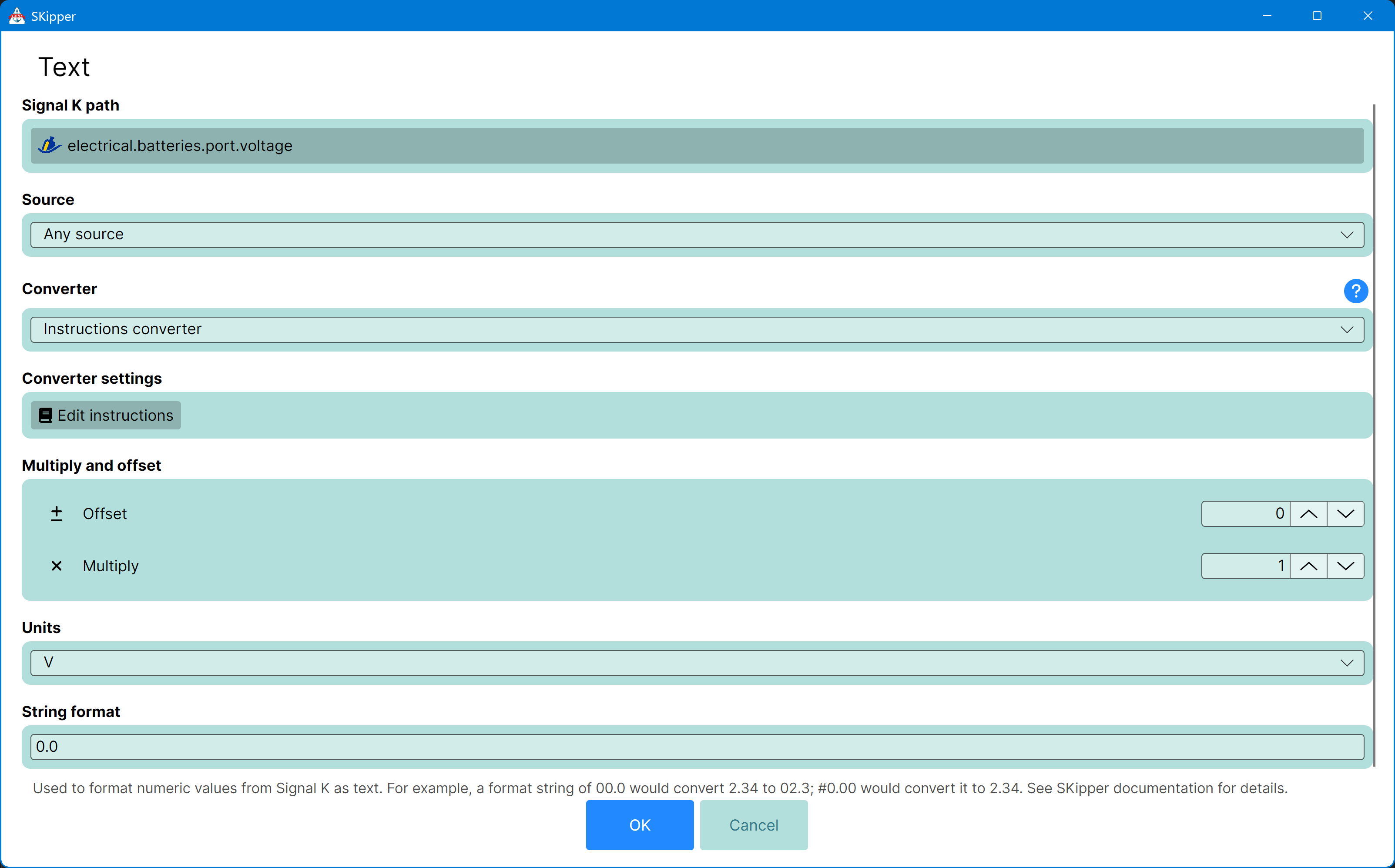
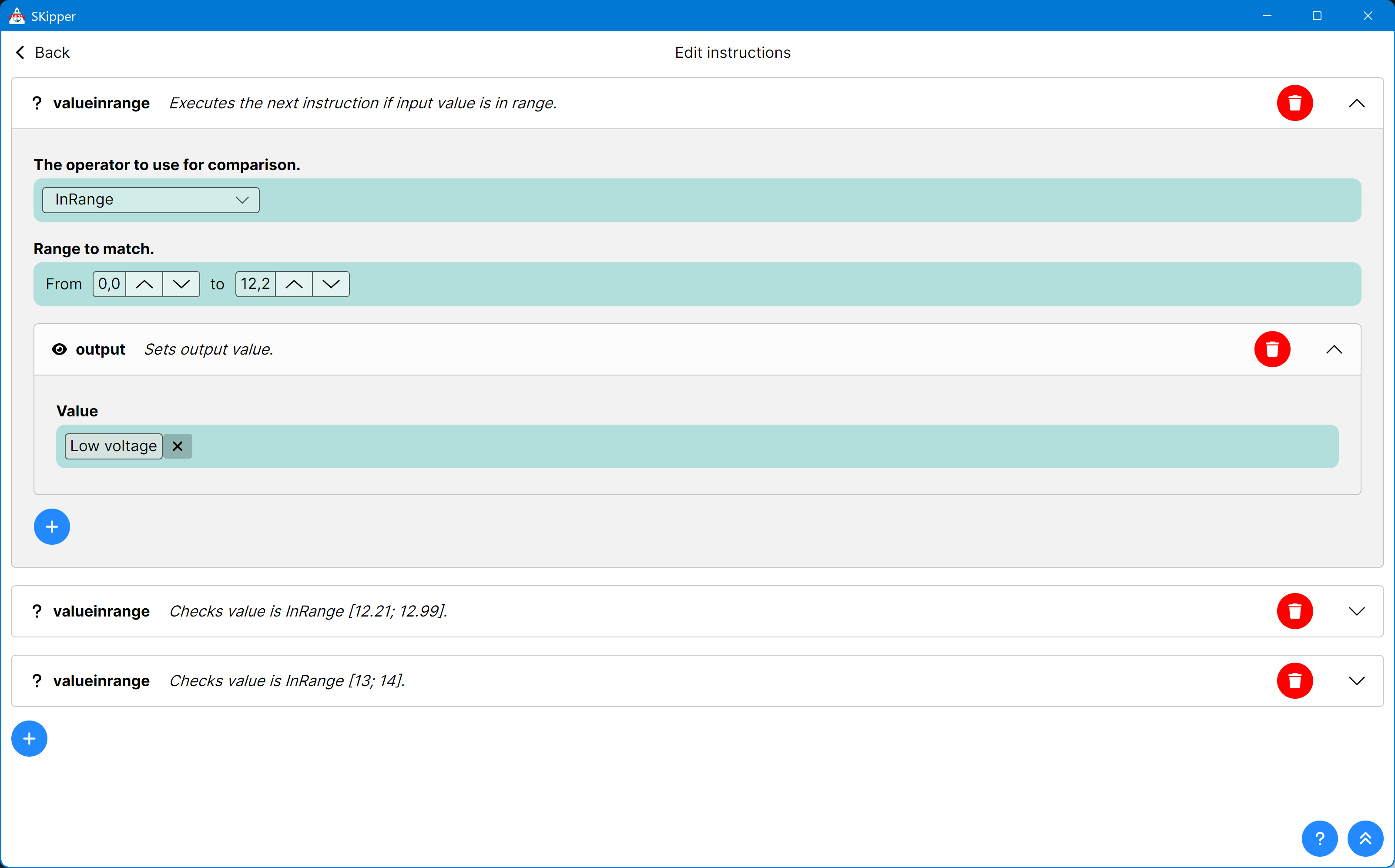
Click on "Edit Instructions" and you'll see an empty Instructions editor. As we did above, add an Instruction of the type ValueInRange. The Operator is "InRange" and the range values are 0.0 and 12.4. Click the blue and white "+" icon immediately under the range, and select "Output" from the menu that pops up. Click on "Change Value Type", then select "Text" from the menu, and type "Low Voltage" into the text field.
You've created an Instruction that will display "Low Voltage" whenever the value of electrical.batteries.port.voltage is from 0.0 to 12.4 volts.
Start another Instruction by clicking the bottom one of the two blue and white "+" icons. This Instruction will be the same, except your range will be 12.4 to 12.8 and your text will be "OK Voltage".
Do that one more time with the range 12.8 to 15.0, with the text "Charging."
Your Instructions screen should look something like this, but with all three Instructions fully defined.
Click on "Back" in the upper left corner to save your Instrucions and close the Instruction editor, then click "OK" to return to the Label Properties page.
You could stop there, but the text would be in a tiny font, and not positioned where you want it, so make these quick changes: - Font size: 60 - Font weight: Ultrabold - Horizontal alignment: Center - Vertical alignment: Center
Now "Close" the Label Properties screen to see your new Label, that will be showing either "Low Voltage", "OK Voltage", or "Charging" in big, bold text.
If you have something that's really important to you - like battery voltage probably is - you could even change the color of the text and the background of this Label Control based on the same Instructions you just used for the text, but use them on the Foreground Color and Background Color properties - both of which can have a binding to a Signal K path.
Flows
Flows allows user to make SKipper reacting to Signal K data. Simple example is switching pages depending on boat state. Are you moored, is your engine on, is boat anchored, flows allows you to setup page switching depending on any Signal K path value.
Flow does have properties you can configure in SKipper, you can have multiple flows running, or waiting for Signal K path change. SKipper has no-code flow instructions editor that allows easy to do flow setup.
So, if you want to create new flow, just go into Home -> Settings -> Manage Flows and Flow manager will appear.
Flows are active only if SKipper is running, when running on mobile OSes like Android, or iOS, it will pause all Flows when the app is in the background. When running on Desktop OSes it can be minimized, but Flows will continue running.
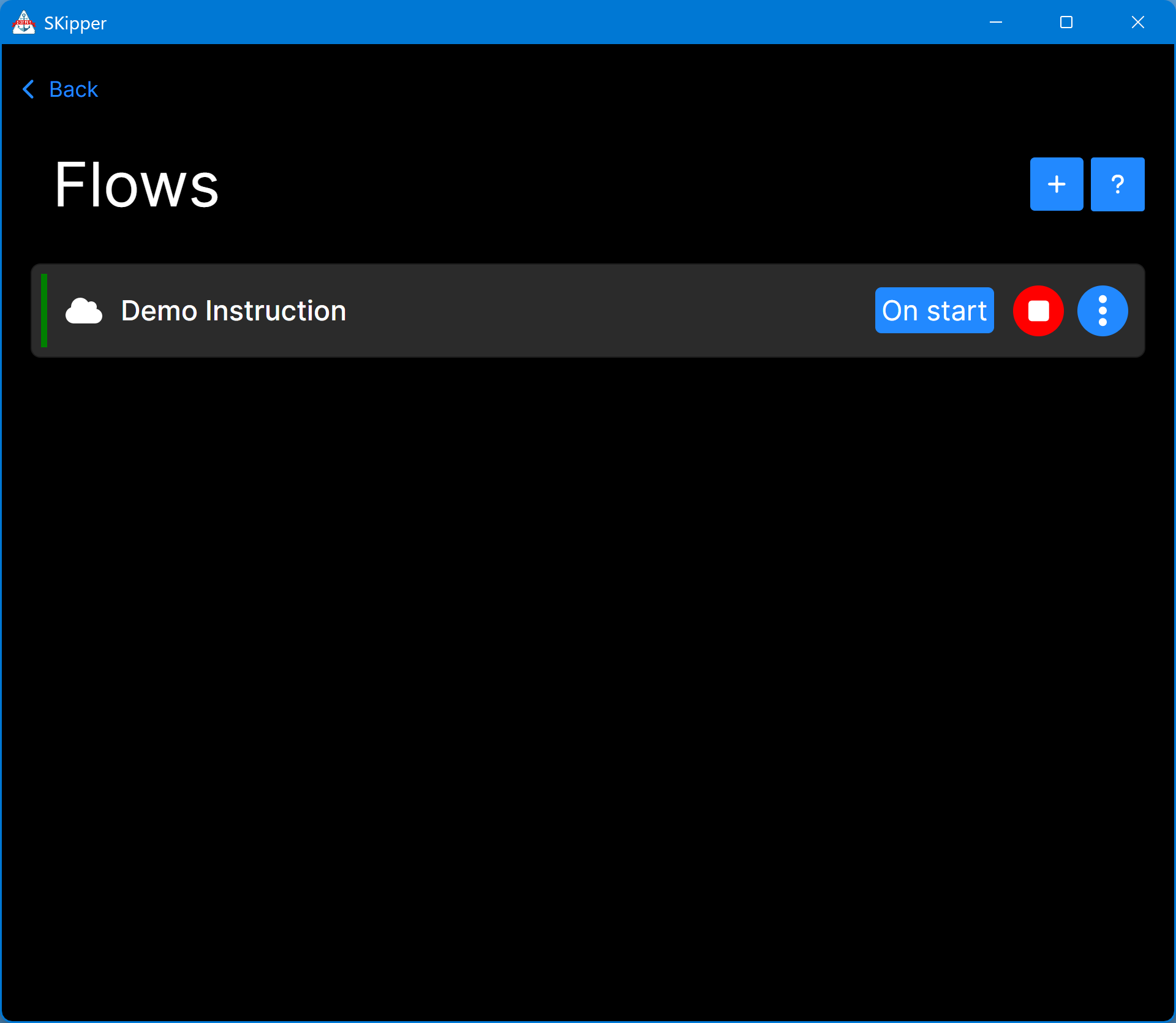
Here you will see all flows created (you will se blank page at the start), but you can hit + button to create new flow.
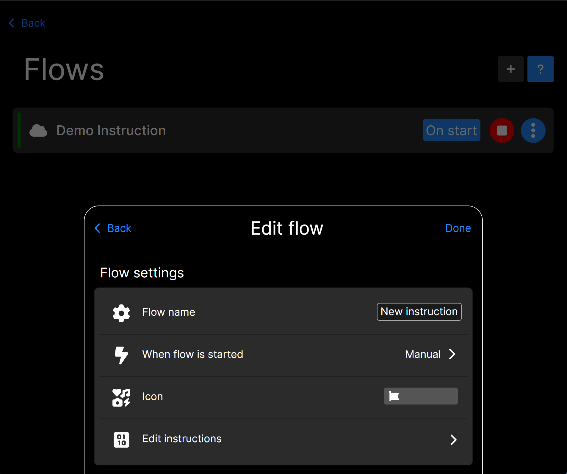
An edit settings modal for your new flow will appear. Here you can write your new flow Name, configure when flow is started.
Options are Manual, StartUp and Binding. Let's describe each.
Manual start
This flow must be started by user either by tapping on play button next to the flow in flow manager, or by Button action, yes you can start flow with button.
StartUp
This flow will be started automatically with SKipper or when updated in manager. It's useful for checking / pooling Signal K status, or creating carousel like page switching with interval. This kind of mode allows Flow to be looping and enables restart instruction.
Binding
SKipper will execute this flow based on Signal K path change. When automatically starting this flow SKipper will not run instructions, but gather all binded to Signal K path instructions (if mostly) and when any of the Signal K path changes, it will execute whole flow when any of the paths are changed. This is ideal for changing pages depending on boat status.
All modes can be used to archive different scenarios. You can have multiple flows with different start up modes.
You can give your flow an Icon to better find what's this flow is about. When Flow is started SKipper will automatically show toast with selected icon, so you know by first glance it's the flow that will help you with anchoring process.
Every Flow does have instructions, editor is no code simple to use. Flows has different instructions then Vector Image or Instructions converter.
Let's dive into what instructions are available.
Available instructions
If instruction
If instruction allows to execute another instructions when condition is evaluated True you can bind if instruction to Signal K path and set Operator* and expected Value. Operator can be Equals, NotEquals, LessThan and GreaterThan. The Value can be Text and Number*.
delay instruction
Delay instruction adds time delay in flow execution (pause if you like), this is good if you need to do some Action then wait some time and execute different Action, for example turn on light for 10 seconds and then turn it off. Another nice example is flow that will change pages every 10 seconds.
break
Break will break execution of Flow, in case of Binding flow it will break only one run, it's good to use it with conjunction If instruction.
action
Yeah, Flow can execute any SKipper action available! You can send PUT Request (light control), control your autopilot, control anchor watch, use any Linux command, and more.
WARNING: Be very careful when using any actions in Flows that can influence control of your boat, never change flows while sailing and carefully test your Flows at marina or anchored. Be sure what you're doing and test first!
restart
Restart will restart Flow from first instruction, this instruction is only valid when instruction has startup mode set to StartUp.
appAction
SKipper action is UI command that can do various action in SKipper UI, like theme change, open pages (Home, Settings, Notifications, Tracks & Routes), change user page (next, previous), Zoom map in, Zoom Map out, toggle map follow or open startup page.
toast
Toast instruction is useful for showing Flow debug messages or informing user silently that Flow has changed something. You can pickup static Text and Icon. Toast will be shown for 8 seconds at the bottom of the screen.
Is There Some Instruction We Should Add?
If there's something you'd like to be able to do with Instructions that you can't do yet, let us know! We'll glady add it! Just go to the SKipper support page on GitHub and add a new issue with a description of what you'd like us to add.