SKipper Overview
SKipper is a tool that allows you to interact with Signal K. It can display data from any Signal K "path" (such as environment.outside.dewPointTemperature, or propulsion.mainEngine.coolantTemperature), and it can also send Signal K "PUT" requests, so you can use it to control a relay, for example. Because every Signal K user uses it so differently, every SKipper installation will be different. It will, in fact, be unique, which is why each SKipper user gets to design their own UI to exactly match how they want to use Signal K data.
To simplify this documentation, we will almost always refer to displaying Signal K data, even though you can also control it with a PUT request. So wherever a reference is made to displaying data, remember that you can also control data.
There are four components that make up each SKipper UI: the Home screen, User-defined Pages, Layouts, and Controls.
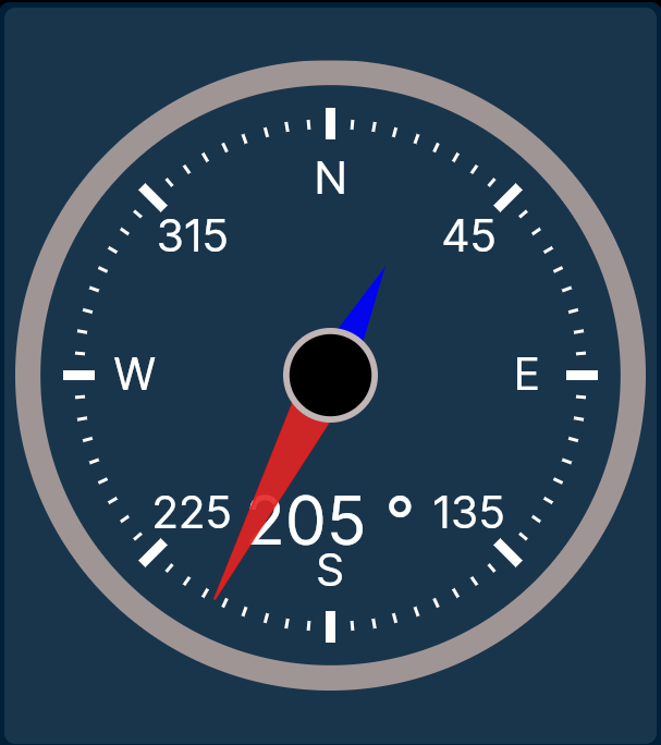
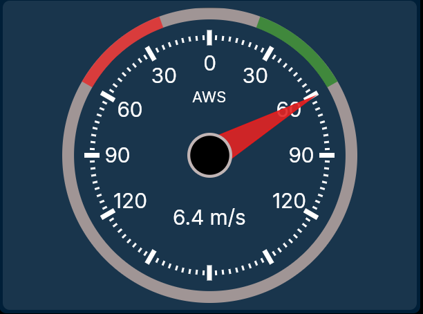
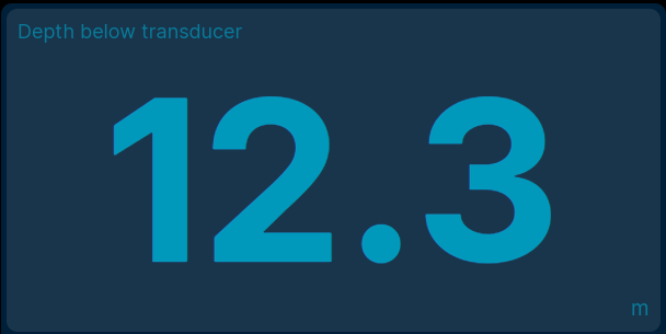
A Control is the lowest level component; one Control displays one Signal K path. Some Controls are very simple, showing only a single number in pure digital format, like the current temperature. Many Controls are some sort of gauge, displaying a number in a more complex, and more meaningful, way. Controls can use Signal K Zones to change colors of data to make it easier for you to know what's going on at a glance. One or more Controls (usually more) are arranged with a Layout, however you choose, to make data easy for you to review and understand quickly.
Control Examples
![]()
You will likely make different Layouts for different devices; 12 small Controls would be easy to see on a laptop or a large tablet, but you might limit it to only six Controls on a phone. A Layout defines not only the position of each Control, but also its size and orientation. This allows you to create something like the images below, with a mixture of large, small, digital, analog, square, portrait, and landscape Controls.
Layout / Page Examples
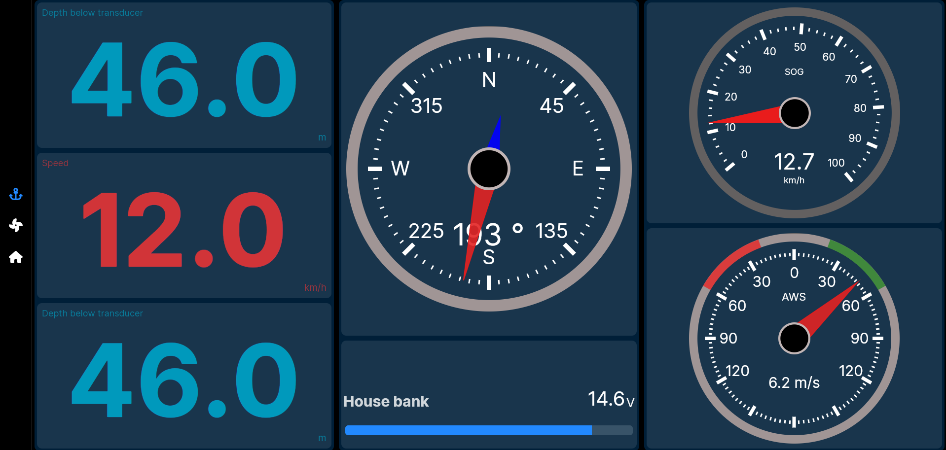
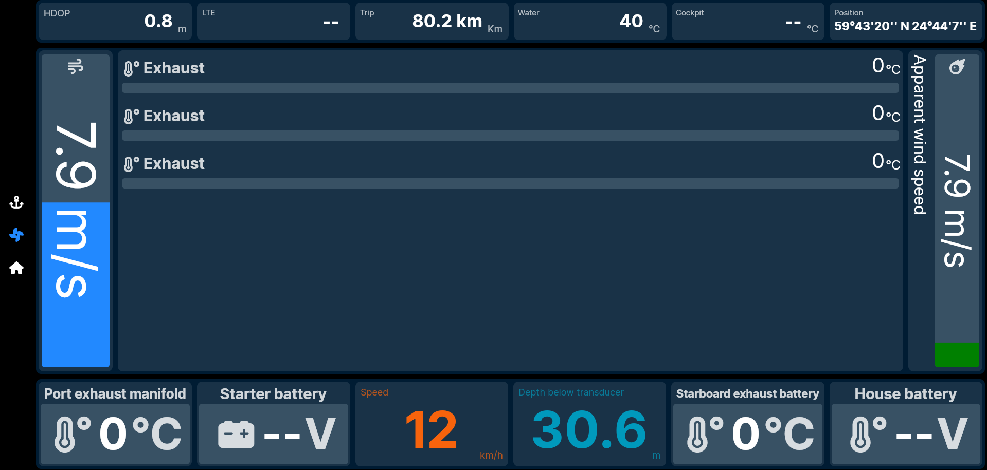
A Page is simply one Layout that's been populated with Controls. Most Pages are accessed with a single click on an icon. Each of the images above is mostly a Layout, but is also a Page, because Layouts and Pages have a one-to-one relationship. Only the thin vertical left side of each Page above is not part of the Layout for that Page. Each icon on the left side represents a Page. If you have a lot of Signal K data to display, you could have Pages like Navigation, Racing, Cruising, Engine Room, Weather, Electrical, etc., etc.
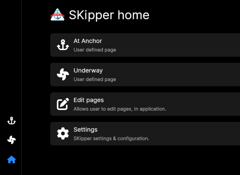
The Home screen looks similar for every SKipper installation. It's where all of your Pages are listed, as well as having menu items for enabling editing of the UI, and for accessing all Settings.
The Home Screen
Creating YOUR UI
The general approach to creating your own SKipper UI is as follows. Details on how to create Pages and Layouts, and how to add Controls, will follow. You may go through this process for each type of device you're going to use for SKipper, because the size and orientation of each device is different. If you're going to run SKipper on a laptop or desktop, we suggest you start with the UI for that first. After you're comfortable creating Layouts, you can move to your smaller devices - tablets and phones.
-
Make a list of all the Signal K paths you want to include in your instance of SKipper. This list may be slightly different for each of your devices, because you may choose, for example, to have a fairly minimal SKipper instance on your phone, because you expect to be using it most often on a large tablet or laptop.
-
Decide which paths you want to be grouped together for easy viewing and understanding - these groupings will be your Pages. For example, you may want all data that relates to your boat's engine grouped together, and all data that relates to sailing grouped together. Each of these groupings will be a separate Page. Note that you can include any Signal K path as many times as you like throughout your SKipper UI. For example, if there are four paths that you want to see on every Page because they are such critical data, you can easily do that, and they can, but don't have to, look the same on each of those Pages. Before you go on, make sure every path from #1 has been put on at least one Page.
-
Create a Page and give it a name and an icon.
-
On the Page, create the Layout you want to effectively view all the paths you want to see on that Page. Your Layout needs to consider the general size and shape of the Controls you will be using to display each path. For example, if you want a Compass Control to show your current heading, be sure to create a square (or at least roughly square) in your Layout for the Compass Control. If you're going to use three HorizontalBar Controls, be sure your Layout includes a Grid divided into three horizontal segments.
-
Add a Control to each spot in the Layout, and bind it to a Signal K path. Connect it to any Zones you have set up for it in Signal K.
-
Repeat steps 2, 3, 4, and 5 until you have created all the Pages and Layouts you want, with all the Controls you want to display all the Signal K data you want to see, on each device.
-
Organize all of your Pages on the Home Screen.
-
Save the UI to the SK Server (from the Settings Page on the SKipper Home Screen).
Now you have a complete UI for one of your devices, with a copy of it on your SK Server. If you're going to use only one device for SKipper, you're done. If you're going to use SKipper on any other device(s), keep reading.
- On another device (Device Two), install SKipper, then download the UI that you saved to the Server (from the Settings Page on the SKipper Home Screen).
If Device Two is the same type as your Device One (laptop, phone, tablet) and their screens are roughly the same shape and size, you won't have to modify the UI for it to work on Device Two. But if they're significantly different, you'll create new Pages for Device Two, either from scratch, or by copying from the Pages you created for Device One. Then modify the copies to work well on Device Two, and keep the originals unmodified so they'll still work on Device One. So...
-
Copy and modify Pages as desired to create the UI for Device Two.
-
Save the UI to the server. Now the saved UI has all the Pages for Device One and Device Two.
-
On the Home Screen on Device Two, hide the icons for the Pages that you don't want to use on Device Two.
Repeat steps 9 - 12 for each additional device. This creates a single main UI that includes every Page you create, allows you to easily put that on any device, but then see only the Pages you want to see on that Device.
Getting Into the Details
We'll cover the details of the above on the following pages. We suggest you do them in the order suggested.
-
Controls Overview - you need to know what all of the Controls look like before you can decide how you're going to lay them out, so start there.
-
Layouts - a Layout defines the size and location of all of your Controls on each Page, so you'll need to know what the various Layout types are.
-
Pages - when you understand Controls and Layouts, it's time to create your individual Pages.
-
Home Screen - finally, organize all the Pages you've created to make them easily accessible.