Pages
Pages
The SKipper UI is simply a collection of Pages, each defined by the user. You will probably have different pages for different types of data (Engine Room, Weather, Electrical, etc.), or for each phase of operation (Sailing, Cruising, Racing, At Anchor, etc.). If you don't have very much data in Signal K, you may have only a single Page to show it all. If you're going to use SKipper on different types of devices (laptop, tablet, phone), you may want to define dfferent Pages for the different devices, to make the data fit and look its best on each one.
If you have multiple Pages, you can have an icon for each of your most commonly used ones on the Icon Bar for one-touch access.
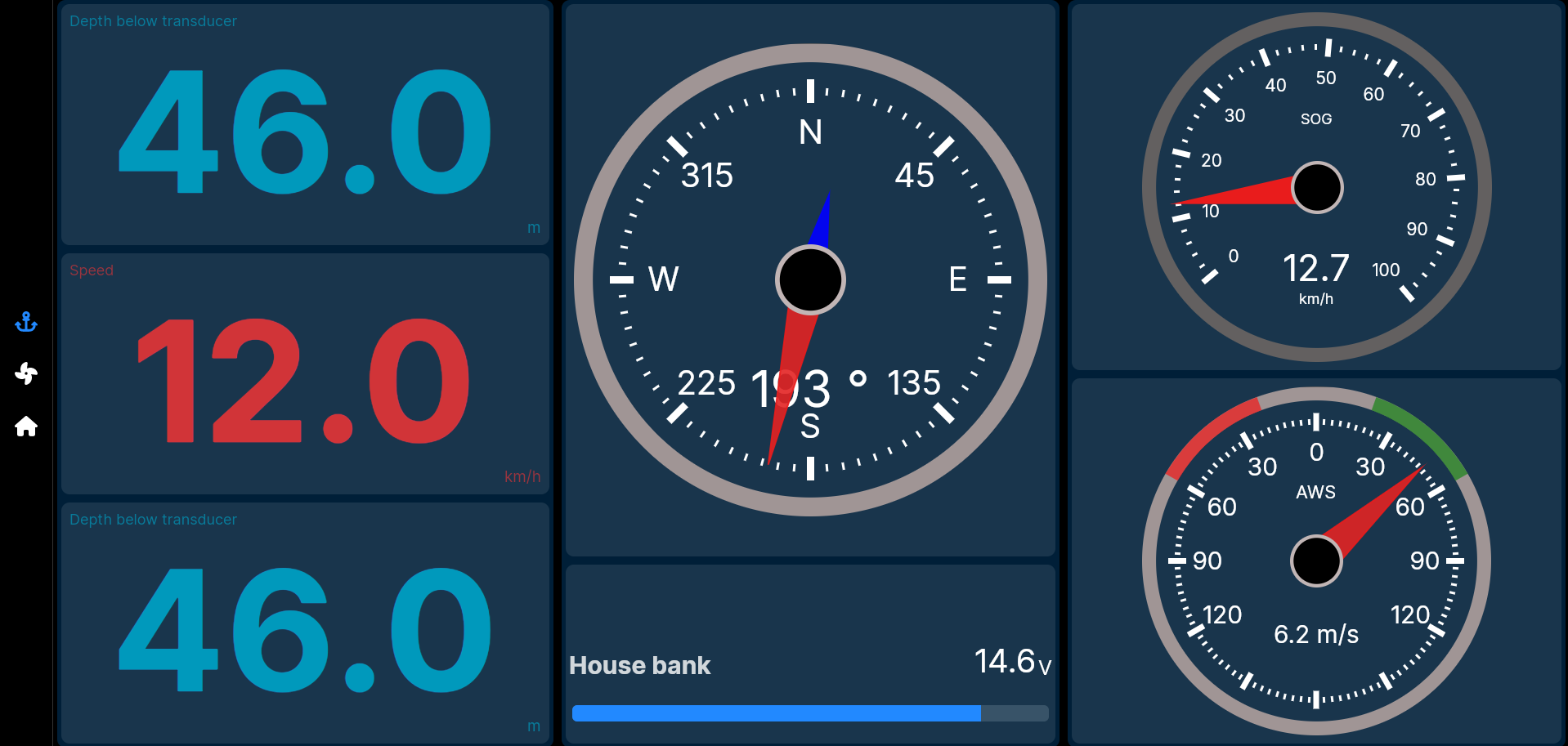
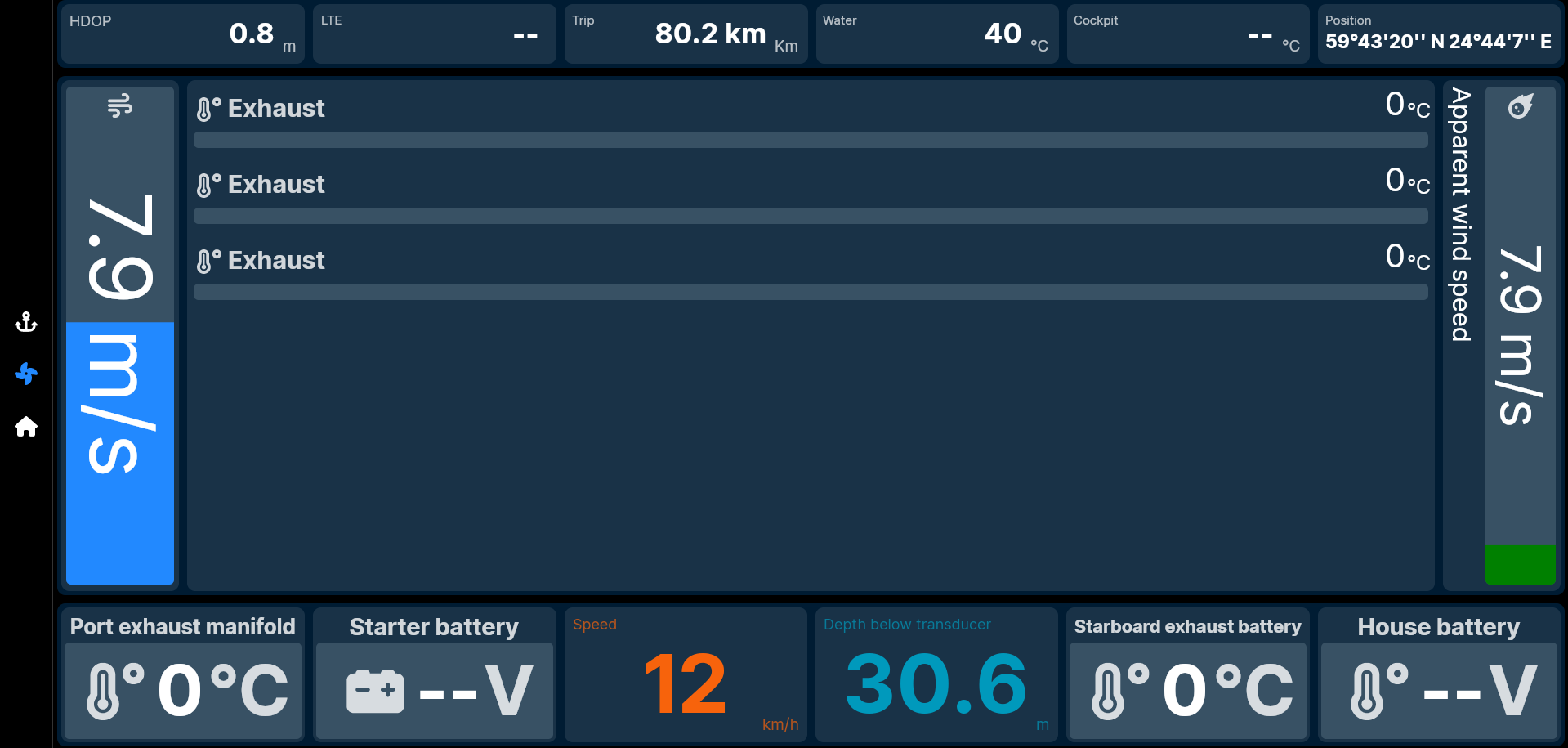
A Page is basically a Layout that's been defined using the different Layout types (Grid, Stack, and Group), then populated with Content Controls. In addition to the Layout, each Page has a name and an icon, and a very basic configuration (to display the icon on the Icon Bar or not, and to make one of your Pages be the first page displayed when SKipper starts). Each of the images above is a Page, which is mostly a Layout, because Layouts and Pages have a one-to-one relationship. Only the thin vertical left side of each Page, where the Icon Bar is, is not part of the Layout for that Page. Each icon on the left side represents a different Page. (On a device that's in portrait layout, the Icon Bar move to the bottom of the screen.)
UI Recap
- The Home Screen lists all of the Pages you have created, plus a few Main Menu items.
- Each Page has a name and an icon, but is mostly a Layout.
- Each Layout consists of Grids and/or Stacks and/or Groups.
- Each Grid, Stack, and Group contains one or more Controls. A Control can be a Content Control for showing or controlling Signal K data, or a Layout Control for further defining the Layout.
- Each Content Control displays or controls the data from a single Signal K data path.
The best way for you to learn how to do all of this is to just do it! Below, we'll walk you through creating your first Page, and then in the next chapter, we'll create its Layout and add all of the Controls.
NOTE: You can do this in any copy of SKipper you have: one that you have installed on a computer, phone, or tablet, or the one that you can play with online. The online version uses the Signal K Server at demo.signalk.org, and you can configure any SKipper installation to use that, too. If you do, you'll have all of the Signal K data paths that are used in the rest of this documentation. If you don't, that's OK - you can still walk through the process of picking the paths, to learn how to do it. Later, when you're creating your own SKipper UI, you'll be working with your own data, so of course you'll have all of the Signal K data paths available to you. (See Getting Started with SKipper for details on installing SKipper.)
New Page
The Page we'll be creating first will demonstrate the general steps of creating any Page, and it will give you some idea of the flexibility of SKipper when creating Layouts to display a lot of data on a single Page. All of the data displayed comes from the Signal K demo data, so that you'll see how the Content Controls actually look in real life usage.
Each new Page will be created from the Home Screen, so click the Home icon on the Icon Bar of any Page in SKipper. If you haven't done anything in SKipper yet, the only icon will be the Home icon, and you'll already be on the Home screen. This is what it looks like:
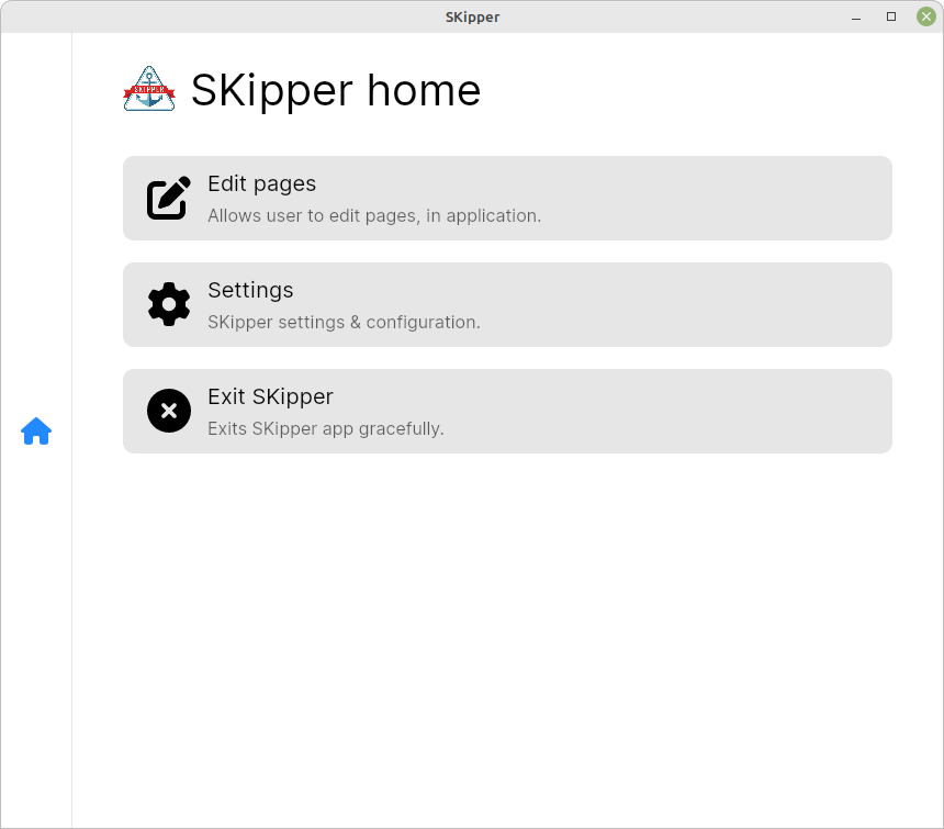
Click on the "Edit Pages" item and the "Edit Pages" screen appears. It currently has no Pages on it, because you haven't defined any yet. Click on the blue "+" button in the upper right corner to add your first Page.
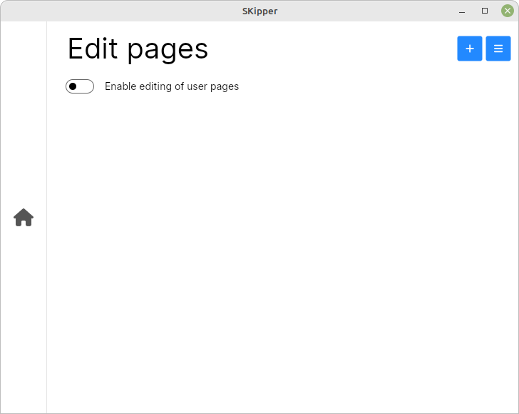
Your options are "New page" or "Start with template". We'll talk about templates later - for now, click on "New page", and the "New page" window pops up.
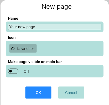
Name your Page (call it "Demo"), leave the icon at "fa-anchor", and enable the "Display icon on Icon Bar" switch. That will give you one-click access to this Page whenever SKipper is running. Click "OK" to continue.
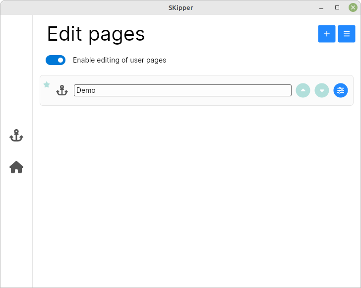
Now you've added a Page named Demo, whose icon is an anchor, and that anchor is always going to be visible on the Icon Bar, as you can see below.
Edit Page
To the left of each Page's icon, there can be another small icon or two. A small "house" indicates that this is the start-up Page, and a small star indicates that the Page's icon will be on the Icon Bar, for one-click access to the Page.
You can arrange the order of your Pages by clicking on the round up-arrow and down-arrow buttons on the right side.
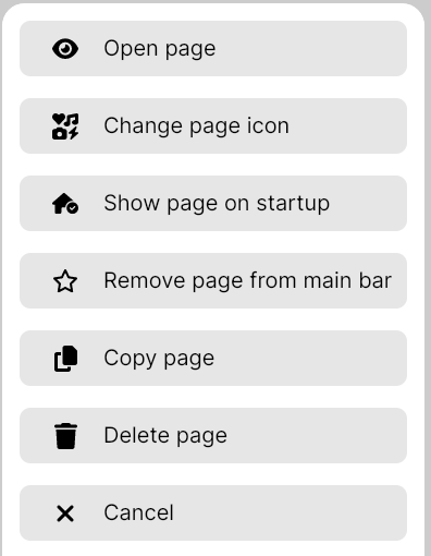
The last button on the right, the common "settings" icon, will display the menu below. The menu items are covered in detail in the Home Screen section.
Now you know how to create, edit and delete Pages. Let's continue with Page creating.